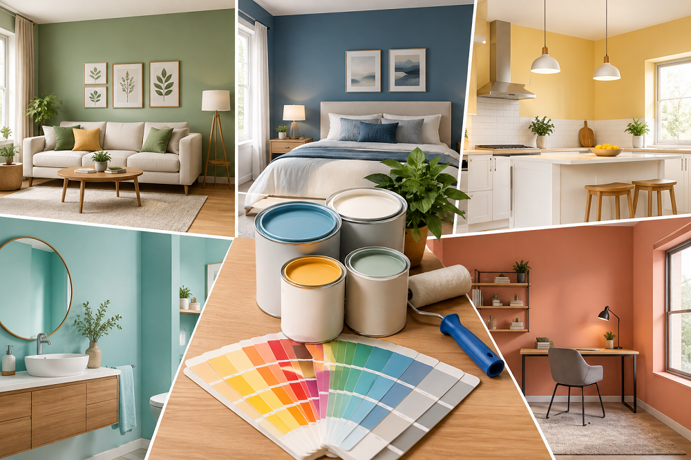
Picking colours sounds like the fun part. Then you’re standing in the paint shop holding a fan deck with four hundred whites on it, and your spouse likes the one on the left, and you genuinely cannot tell them apart anymore.
Personal taste is only half of it, though. How much light the room gets, how big it is, which direction the windows face, how humid it stays through May all of that changes what a shade looks like once it’s actually on your wall, and how long it stays looking that way. Go room by room and the whole thing gets a lot less intimidating.
Why Chennai’s Climate Matters for Colour and Finish
Heat and humidity mess with paint indoors, not just outdoors.
Dark shades soak up heat. In a small bedroom with one window, a deep charcoal will make the space feel closer and warmer than the same colour would in a large, airy room. Finish matters too. Matte and eggshell cope with humidity better than high gloss in enclosed spaces; gloss tends to show every bit of condensation and every fingerprint.
Then there’s the salt air. If you’re in Besant Nagar or Thiruvanmiyur, or anywhere on a ground floor, coastal moisture creeps into walls in a way it simply doesn’t in, say, Coimbatore. Paints formulated to resist damp and mild mould growth are worth the upgrade there. Skip it, and you’ll be touching up patches near the skirting within a couple of monsoons.
Living Rooms (Light, Adaptable Neutrals)
Soft neutrals earn their reputation here. Warm whites, light greys, and muted sand tones bounce natural light around, and they don’t argue with whatever sofa you buy three years from now. Most interior home painting jobs in living rooms land somewhere in this family for exactly that reason.
Smaller living area? Lighter shades genuinely help. Not a trick, just physics: more light reflecting off the walls reads as more space.
If plain neutrals feel boring, one accent wall in a deeper tone does a lot. A textured finish works too. Just keep it to one wall, particularly in apartments around T. Nagar or Anna Nagar where the living room is already compact.
Bedrooms (Cooler Tones for Better Rest)
Soft blues, sage greens, warm greys. Cooler shades dominate interior room painting in bedrooms because they settle a space down instead of energising it, which is what you want at 11 pm.
There’s a psychological bonus in Chennai specifically. Our nights stay warm for most of the year, and a cool-toned wall makes a room feel less hot. It isn’t actually cooler, obviously. The thermometer doesn’t care what colour your wall is. But it reads cooler, and that counts for something in April.
Stick with matte. It forgives uneven plaster and old patch repairs far better than anything with sheen.
Kitchens (Practical Shades That Handle Moisture)
Kitchens need paint that can stand up to steam, grease, and frequent cleaning. Light, practical shades like off-white, pale green, or soft yellow are popular for interior painting services in kitchens, paired with a satin or semi-gloss finish that wipes clean easily.
The moisture point is worth repeating. Chennai kitchens hold steam longer than kitchens in drier cities do, especially the closed ones with a single small window. Paying a bit more for a wet-area-resistant paint is one of the few upgrades that clearly pays for itself.
Children’s Rooms (Bright but Durable)
This is the room to be bold in. Coral, mustard, sky blue go ahead.
Durability is the real constraint, not colour. Walls in a child’s room take crayon, sticker residue, scuffs from furniture being dragged around, and the occasional unexplained handprint at knee height. Washable, low-odour paints in a matte-but-wipeable finish hold up. A regular matte will not, and you’ll know within a month.
Home Offices and Study Areas
A lot more Chennai homes have carved out a work corner since 2020, and the colour advice for these has settled into a fairly consistent range: muted blues, greens, warm greys. Nothing too bright, nothing too dark. These tones are generally associated with better concentration, and more practically, they look far better behind you on a video call than a busy wallpaper or a saturated red.
Keep the wall you sit against plain. Save the interesting colour for the wall behind your chair, the one nobody on the call ever sees.
Bathrooms (Built for Constant Moisture)
Bathrooms need dedicated moisture- and mould-resistant paint, full stop. In a humid coastal city, ordinary wall paint can start bubbling and peeling inside a year. I’ve seen it happen in eight months in a badly ventilated ground-floor bathroom.
Light aqua, soft grey, crisp white. Semi-gloss or a proper waterproof finish. These are boring recommendations because they’re the ones that actually last.
Balconies and Semi-Open Spaces
Most Chennai homes have one of these: a balcony, a sit-out, a semi-open utility area near the washing machine. They’re technically inside the house and technically exposed to the weather, which makes them awkward to plan for.
Treat them as exterior. They catch direct sun for hours and take sideways rain during the monsoon, so weather-resistant paint is the right call even though the space feels indoor. Light neutrals do well here for the same reason light-coloured cars do: less heat absorbed, cooler space by afternoon.
Test the Colour In Actual Room
Small printed swatches lie. Not deliberately, but a two-inch square held up against a wall tells you almost nothing about how that shade will behave across twelve feet of it, under your tubelight, at 7 pm.
Paint a sample patch. Look at it in the morning, look at it again after dark. Colours shift dramatically between daylight and artificial light, and cheap CFLs will pull a warm beige towards yellow in a way that will annoy you forever once you notice it.
This is also where a proper consultation earns its keep. Good interior painting services will bring a wide shade range to your home (2,000-plus shades and a decent spread of texture options is a reasonable benchmark) so you can hold finishes side by side in your own light instead of guessing in a showroom. Brand matters more here than it would in a drier city, too. Colour retention and moisture resistance are what decide whether a fresh coat still looks fresh eighteen months later.
Let Rooms Talk to Each Other
Every room can have its own personality. That’s the point. But the house shouldn’t feel like eight unrelated decisions stitched together, which is what happens when each room is chosen in isolation on a different weekend.
The simplest fix: keep the undertones in one family. All warm, or all cool, across spaces that are visible from each other. It matters most in open-plan homes where the living and dining areas run together; a warm-toned living room flowing into a cool grey dining area looks off even if you can’t immediately say why.
In Summary, there’s no universally correct colour for a bedroom or a kitchen. There’s only the colour that suits how you use the room and how Chennai’s weather is going to treat it over the next few years.
Plan it room by room, test before you commit, and get someone experienced to look at the actual walls first. The difference between that and picking shades off a website shows up on your walls for the next decade.