Handmade soap is sold in local shops by a small skin care company. Product quality is good, but sales are low because customers cannot recognize it in the overcrowded shelves. Packaging appears flat, and is less noticeable and easily recognized from other similar packaging.
The brand only changes one thing, the color system of its Soap Boxes. Changes from random to a structured color approach by scent and product type. Following this change, the shelf visibility is enhanced. Products are more visible to the customer. Pickup rate increases. This is done without altering the formula or the price.
Step 1: Define Your Brand Identity and Brand Pillars
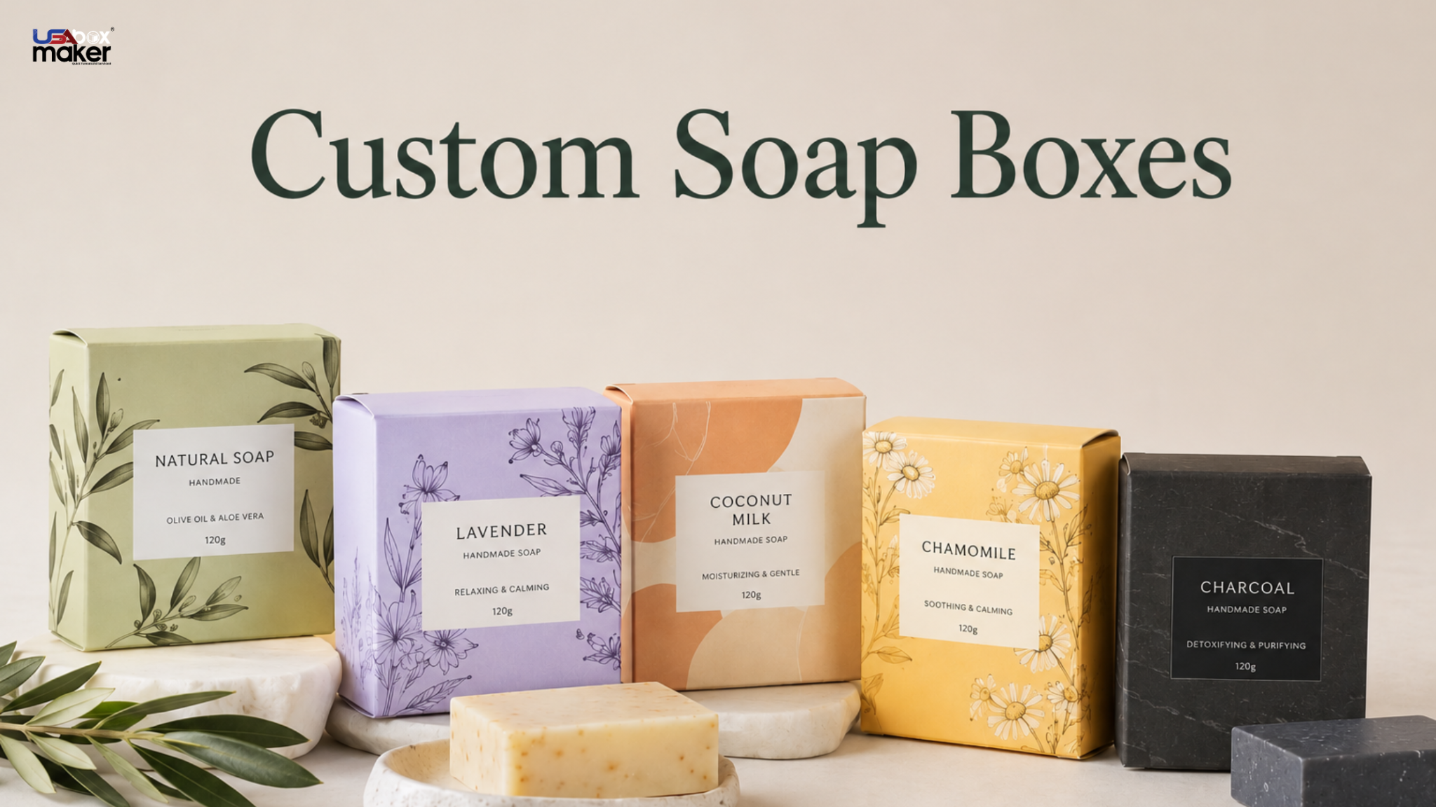
Before you start, you have to ask yourself what your soap brand is. It could be natural care, luxury skin care, herbal use, or clinical cleaning. The color direction needs to be aligned clearly with your respective category, as it influences customer expectations. Natural soaps use green, beige, and brown tones for earth based care. Luxury soaps use black, gold, and cream tones for a premium feel.
L’Occitane uses soft, natural packaging and warm tones for a handcrafted, premium feel. Kiehl’s uses a clinical apothecary style and simple color blocking and labels. Both show one thing. Color defines brand personality. Custom Printed Soap Boxes should follow one stable color system. This helps to prevent them from becoming confused or lost on crowded shelves.
Step 2: Use Color Psychology for Soap Products
The psychology of color influences the perception of your customers before they delve into the product information. For consumers in the Retail Industry, the color of packaging is the first to indicate trust, quality, and purpose of the product. Blue suits medical soaps as it feels clean and pure. Green suits herbal soaps as it feels natural and fresh. White gives a simple, delicate appearance and is suitable for sensitive skin.
When used well, black and darker colors can be used for luxury positioning. Yellow and orange suit energetic or fruit-based soaps. They should not overpower the design. A strong system uses one main color with a supporting tone.
Step 3: Match Colors with Scent and Ingredients
The scents are tied to colors, and this helps the customers to quickly recognise the products without reading the labels. Soft purple is often a lavender color and is used for relaxation and calm. Lemon pairs with yellow for freshness and energy. Mint is tied to a light green color, and rose to pink shades.
Lush uses a color palette that is bold and bright. It helps to quickly differentiate the product scents on the shelves. The Body Shop uses scent-inspired packaging themes. It maintains clarity of each range by keeping the color rules the same. When it comes to a Soap Subscription Box, color coding is even more crucial.
Step 4: Understand Your Target Market
Different people react differently to different colors. This affects product performance. Younger customers often prefer bright, bold colors. Clear colors also improve recognition and unboxing. Neutral, soft shades are the preferred option of older clients. They feel calm and safe.
Neutrogena uses a clean clinical design focused on clarity and dermatologist trust. Drunk Elephant uses bright, contrasting colors for a playful, premium feel. Kiehl’s keeps a heritage apothecary style with simple functional packaging. When color matches user psychology, it improves trust and shelf relevance.
Step 5: Consider Printing Reality
Packaging design must be tested in real printing conditions. It should not rely only on digital screens. Colors often shift from screen to print. This happens because of CMYK conversion, paper texture, and coating types. Up to 15–20% color difference can appear. This depends on the material and printing process.
A soft digital shade can look less intense or lighter in print. A shiny surface will make a surface brighter, a matte surface will make it darker. The Method is based on bold color blocking that is extremely controlled to ensure uniformity on retail shelves. Lush is based on high saturation colors that can stand up to various lighting environments.
The two approaches illustrate the influence of print reality on the selection of brand colors.
Sample prints should be tested for full production. This helps avoid color mismatch and maintains uniformity of batches.
Step 6: Build Strong Shelf Contrast
Shelf competition is strong, and products have only a few seconds to catch the attention of the consumer. Soap boxes become visible quickly when they are contrasted. Darker colors increase visibility where there is a lot of light packaging on the shelves. Lighter packaging designs are more visible if dark packaging is dominating the shelves.
Aesop uses minimal monochrome contrast. It offers a serene, luxurious look. It differentiates itself from the rainbow of competition. Drunk Elephant displays high-contrast color caps and packaging. It helps in instant recognition in busy skincare aisles. A good shelf strategy has one dominant visual element. This could be a daring colored block or a clear logo space. This enhances clarity and helps remove confusion.
Conclusion
Color directly affects how customers notice and remember a product within seconds. In retail locations, it can always determine if a product is picked up or overlooked. Custom Packaging Boxes are best when their color matches the brand identity, product type, and the real printing conditions. This helps to enhance the visibility, clarity, and customer response.