Online traffic feels great until you realize peope are visiting your store, clicking around, and leaving without buying anything. It is frustrating, right? You spend money on ads, post on social media, work on search rankings, send emails, and still the sales chart barely moves.
The truth is, getting visitors is only half the job. Turning those visitors into paying customers is where many online stores fall short.
Most store owners assume low sales mean they need more traffic. Sometimes they do. But in many cases, the bigger problem is not traffic. It is the buying experience. People are landing on the website, but something is stopping them from taking the next step.
Maybe the site loads slowly. Maybe the product details are thin. Maybe shipping costs appear too late. Maybe the checkout feels risky. Small issues add up fast.
A customer may not tell you what went wrong. They just leave.
That is the hard part.
If your online store is getting visitors but not enough sales, you need to look at the full journey. What does the customer see first? What do they feel? Do they trust the site? Is it easy to compare products? Can they buy without confusion?
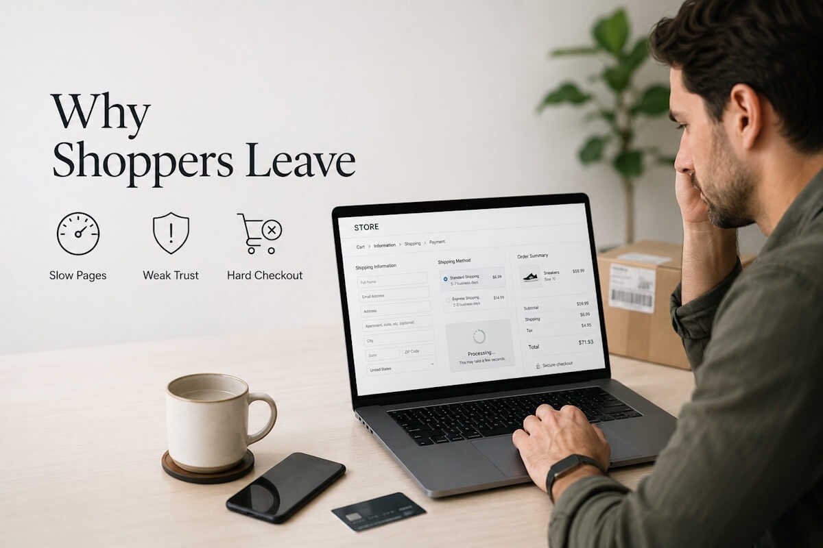
Let’s break down the common reasons online stores fail to convert visitors into customers, and what you can do to fix them.
Your Website Makes a Weak First Impression
People judge an online store in seconds. That may sound harsh, but it is true. When someone lands on your homepage or product page, they quickly decide whether the site feels trustworthy.
A cluttered layout can make users feel lost. Poor images can make products look cheap. Outdated design may raise doubts about whether the store is still active. If the site looks unfinished, visitors may wonder if their payment information is safe.
First impressions are not only about beauty. They are about clarity.
A strong online store tells visitors three things right away: what you sell, why it matters, and what they should do next. If users have to search too hard for these answers, they may leave before exploring your products.
Your homepage should not try to say everything at once. Keep it focused. Highlight your main categories, best-selling products, clear offers, and trust signals. Make navigation easy. Use clean visuals. Avoid overwhelming shoppers with too many banners, popups, or competing messages.
Think about your own behavior. Would you buy from a store that feels messy or confusing? Probably not.
Product Pages Do Not Answer Real Customer Questions
A product page is not just a display shelf. It is your sales conversation.
Many online stores fail because their product pages are too thin. They include a name, price, short description, and maybe a couple of images. That is not enough for most buyers.
Customers want details. They want to know size, material, features, use cases, delivery time, return options, care instructions, warranty, and what makes the product worth the price. If those answers are missing, doubt creeps in.
And doubt kills conversions.
Good product content should feel like a helpful store associate. It should guide the shopper, answer common concerns, and make the buying decision easier.
Use clear product titles. Add detailed descriptions without stuffing them with fluff. Include multiple images from different angles. Add videos when useful. Show size charts, comparison tables, FAQs, and customer reviews.
You do not need to overcomplicate it. Just ask yourself this: what would a customer ask before buying this product in person? Then answer those questions on the page.
That alone can improve conversions.
Slow Loading Speed Pushes Buyers Away
Nobody enjoys waiting for a store page to load. Online shoppers are impatient because they have options. If your site takes too long, they can open another tab and buy from someone else.
Slow speed affects the full shopping journey. It can hurt product browsing, search, cart updates, payment pages, and even mobile performance. A delay of a few seconds may seem small to you, but for a shopper ready to buy, it feels annoying.
Large images, heavy scripts, too many plugins, poor hosting, and unclean code can slow down your store. The problem becomes worse during sales, holidays, or paid ad campaigns when traffic spikes.
Speed is not only a technical issue. It is a sales issue.
Compress images. Remove unused apps and scripts. Choose better hosting. Test performance on mobile, not just desktop. Keep the checkout light and fast. If your store is built on a custom platform, work with developers who understand performance from the start.
This is where professional eCommerce Development Services can make a difference, because your store’s structure, speed, checkout flow, and user experience all need to work together.
The Checkout Process Has Too Much Friction
A visitor may love your product and still abandon the cart if checkout feels painful.
This happens all the time.
Maybe the form asks for too much information. Maybe users are forced to create an account. Maybe payment options are limited. Maybe shipping costs appear at the last step. Maybe the coupon code field distracts them. Maybe there are too many pages before payment.
Every extra step gives shoppers another chance to quit.
A smooth checkout should be simple, clear, and quick. Let users check out as guests. Show shipping costs early. Offer common payment options. Use clear error messages. Keep the form short. Show progress steps if checkout has multiple pages.
Trust also matters here. Display secure payment badges, return policy links, support contact details, and order summary clearly. Shoppers want to feel safe before entering card details.
Do not make them guess.
Hidden Costs Break Trust
Few things irritate shoppers more than surprise charges at checkout.
A customer sees a product for $49. They add it to cart. Then checkout shows shipping, taxes, handling fees, or some other charge that pushes the total much higher. Many shoppers leave right there.
It is not always about the amount. It is about the surprise.
People like price clarity. If shipping is not free, say it early. If taxes vary by location, explain that. If there are delivery charges for certain areas, show the estimate before checkout.
Being upfront does not scare customers away as much as hiding costs does. In fact, clear pricing can build trust.
You can also use free shipping thresholds, bundled offers, or delivery estimates to reduce hesitation. For example, “Free shipping on orders over $75” gives shoppers a reason to add more items while keeping expectations clear.
Your Store Does Not Build Enough Trust
Trust is a major reason people buy online. It is also a major reason they leave.
New visitors may not know your brand. They need proof that you are real, reliable, and worth buying from.
That proof can come in many forms: customer reviews, ratings, testimonials, secure payment labels, return policy, warranty details, contact information, business address, social media presence, and fast support options.
If your store has none of these, shoppers may hesitate.
A clean design helps, but trust needs more than design. Your policies should be easy to find. Product reviews should feel real. Contact details should not be hidden. Live chat or quick support can help too, especially for products that need explanation before purchase.
Trust is built in small moments.
When a visitor sees honest reviews, clear policies, and a smooth website, they feel more comfortable buying. When those things are missing, they may leave even if they like the product.
Mobile Experience Is Treated Like an Afterthought
Many shoppers browse and buy from phones. Yet plenty of stores still feel like they were built mainly for desktop users.
That is a costly mistake.
On mobile, small problems become big ones. Tiny buttons are hard to tap. Long forms are annoying. Slow pages feel slower. Product images may crop badly. Menus can feel clunky. Checkout can become a chore.
If mobile visitors are leaving, check the experience yourself. Do not only resize your desktop browser. Use a real phone. Browse products. Add items to cart. Apply a coupon. Try checkout. See where it feels awkward.
Mobile buyers need speed, clean layout, easy search, visible cart access, simple filters, and quick payment options. Keep content readable. Make buttons large enough. Avoid intrusive popups that cover the screen.
Your mobile site should not feel like a smaller version of your desktop site. It should feel designed for how people shop on phones.
Navigation Makes Products Hard to Find
If shoppers cannot find what they want, they cannot buy it.
Simple enough.
Poor navigation is a silent conversion killer. It may not look like a major issue at first, but it affects how people move through your store. Confusing categories, weak filters, broken search, and unclear menus can make shopping feel tiring.
Online buyers often arrive with a goal. They may want a specific product, size, color, price range, brand, or style. Your job is to help them get there fast.
Use clear category names. Keep filters useful. Make search smart enough to handle misspellings and related terms. Show breadcrumbs so users know where they are. Let shoppers sort by price, popularity, ratings, and new arrivals.
Do not bury popular products deep inside the site. If something sells well, make it easy to reach.
Good navigation feels invisible. The customer just moves, finds, compares, and buys.
The Call to Action Is Weak or Confusing
Your call to action tells visitors what to do next. In eCommerce, that usually means Add to Cart, Buy Now, Checkout, or View Product.
Some stores make these buttons hard to see. Others use unclear wording. Some place too many buttons near each other, causing confusion. A visitor should never have to search for the next step.
The main action button should stand out. It should be placed where users expect it. On product pages, keep it near price, quantity, size, color, and delivery details. On mobile, sticky Add to Cart buttons can work well when used carefully.
Avoid clever labels that make users pause. Clear beats cute.
“Add to Cart” works because people understand it right away.
Poor Search and Filters Create Friction
Search is one of the fastest paths to purchase. A shopper who uses site search often has higher intent than someone casually browsing. So when search does not work well, you lose ready buyers.
Bad search results can happen for many reasons. Product names may not match customer language. Search may fail on spelling errors. Filters may be missing. Out-of-stock products may appear first. Results may not show useful details like price, image, ratings, or availability.
Fixing search can create a direct lift in sales.
Track what people search for. Look at zero-result searches. Add synonyms. Improve product tags. Let users filter results after searching. Make search visible, especially on mobile.
Your customers may not use the same words you use internally. Pay attention to their language.
Product Images Do Not Do Enough Selling
Online shoppers cannot touch the product. Images carry a lot of weight.
Poor images create uncertainty. Blurry photos, limited angles, bad lighting, or no lifestyle images can make even good products look unappealing. For items like apparel, furniture, accessories, electronics, beauty products, and home goods, images often decide whether users keep exploring.
Use sharp, high-quality images. Show the product from multiple angles. Include zoom. Show scale. Add lifestyle shots when useful. For apparel, show different body types if possible. For furniture, show the item in a real room. For accessories, show close-ups.
Your product images should reduce guesswork.
A shopper should not have to wonder how big the item is, what texture it has, or how it looks in real use.
Return Policy Is Hard to Understand
A clear return policy can make customers feel safe. A confusing one can stop them from buying.
People want to know what happens if the product does not fit, arrives damaged, or is not what they expected. If they cannot find the answer quickly, they may choose a competitor with clearer terms.
Place your return policy where shoppers can see it before checkout. Use plain language. Explain the return window, condition requirements, refund method, exchange process, and who pays for return shipping.
Do not hide the details in dense legal text.
A fair and easy-to-read policy can reduce purchase anxiety. It tells shoppers, “We stand behind what we sell.”
That matters.
Your Pricing Does Not Feel Justified
Price is not only about being cheap. It is about perceived value.
A customer may pay more if they understand why the product is worth it. But if your product page does not explain value, the price can feel high.
Show what the customer gets. Explain features, benefits, materials, support, warranty, shipping perks, bundles, or anything that helps justify the cost. If your products are premium, say why in simple terms.
Avoid vague claims. Be specific.
Instead of saying a bag is “high quality,” mention the material, compartments, stitching, water resistance, or warranty. Instead of calling a skincare item “great,” explain who it is for and how it fits into a routine.
The more clearly you explain value, the less shoppers focus only on price.
Your Store Ignores Cart Abandonment
Cart abandonment is normal, but ignoring it is expensive.
Many shoppers add products to cart and leave because they get distracted, compare prices, wait for payday, or need more time. Some are not lost forever. You can bring them back with the right follow-up.
Use abandoned cart emails. Keep them helpful, not pushy. Remind users what they left behind. Include product images, price, and a direct cart link. You can add customer support contact details or answer common concerns.
Retargeting ads can also help, but be careful with frequency. Nobody wants to feel chased around the internet.
You can also reduce abandonment before it happens by showing delivery dates, return info, shipping costs, and payment options earlier in the journey.
The Store Is Built Without a Clear Growth Plan
Some stores are launched quickly with basic features, then problems appear later. The catalog grows. Traffic increases. New payment options are needed. Marketing tools need to connect. The checkout needs changes. The admin panel becomes hard to manage.
At that point, the store starts holding the business back.
A good eCommerce setup should support today’s needs and leave room for growth. That includes product management, inventory, orders, shipping, taxes, customer accounts, promotions, analytics, CRM, email tools, and reporting.
This does not mean every store needs a huge budget from day one. It means the foundation should be planned well.
Many business owners also worry about ecommerce website development cost when deciding what to build. That is fair. The smart move is to focus on features that affect sales, customer experience, and daily store management first. Fancy extras can wait.
Start with the basics that move revenue: fast pages, strong product pages, easy checkout, secure payments, clear navigation, mobile shopping, and simple admin controls.
You Are Not Testing What Works
Guessing is risky.
Many store owners make changes based on personal taste. They change colors, rewrite headlines, add banners, or move buttons because it “feels better.” Sometimes that works. Often, it does not.
Use data.
Track conversion rate, bounce rate, cart abandonment, checkout drop-off, product page views, search terms, and traffic sources. Use heatmaps or session recordings to see how people behave. Run A/B tests where possible.
You may discover that users miss the size chart, ignore your banner, struggle with filters, or drop off when shipping appears.
Data helps you stop guessing.
It also helps you make smaller, smarter changes instead of rebuilding the whole store without knowing what broke.
Your Messaging Sounds Too Generic
Many stores sound the same. They say they offer great products, best prices, fast shipping, and top service. Buyers have heard it all before.
Generic messaging does not help people choose you.
Your copy should explain what makes your store useful to the customer. Are your products better for beginners? Do you offer expert support? Do you ship faster in certain areas? Are your bundles easier for first-time buyers? Do your products solve a specific pain point?
Be clear and honest.
Talk like a person. Avoid stiff sales copy. Give shoppers the information they need without making them dig.
A good test is simple: remove your brand name from the page and read the copy. Could it belong to any other store? If yes, it needs more specific detail.
Customer Support Is Too Hard to Reach
People ask questions before buying. That is normal.
If support is hard to find, shoppers may leave. They may wonder about sizing, delivery, compatibility, returns, or product use. A quick answer can turn hesitation into purchase.
Offer visible support options. Live chat, email, phone, contact form, and FAQ pages can all help. The right choice depends on your business and product type.
Make response times clear. If live chat is not available 24/7, say when it is open. If email replies take one business day, mention it.
Customers do not expect perfection. They expect clarity.
Personalization Is Missing
Not every shopper wants the same thing. A first-time visitor, returning customer, discount seeker, and loyal buyer may all need different experiences.
Personalization can help when done tastefully. Show recently viewed products. Recommend related items. Suggest bundles. Send emails based on browsing or purchase behavior. Display location-based shipping estimates when possible.
Do not overdo it.
Personalization should make shopping easier, not creepy. The goal is to help users find relevant products faster.
A simple “You may also like” section can work well when recommendations actually make sense.
Fix the Journey, Not Just the Button
Many store owners look for one magic fix. Change the button color. Add a popup. Offer a discount. Rewrite the headline.
Sometimes these changes help. But conversions usually improve when the whole journey gets better.
Look at your store from the visitor’s view. Can they understand your offer? Can they trust you? Can they find products? Can they compare options? Can they buy without stress? Can they get support if needed?
Online sales depend on many small decisions working together.
You do not need to fix everything overnight. Start with the biggest leaks. Check mobile speed. Review your top product pages. Simplify checkout. Add trust signals. Make shipping and returns clear. Improve product content. Track what changes.
That is how conversion improvement becomes practical.
Turn Visitors Into Buyers With a Better Store Experience
Most online stores do not fail because the products are bad. They fail because the shopping experience creates too much friction.
Visitors leave when they feel confused, unsure, delayed, or surprised. They buy when the site feels clear, fast, useful, and trustworthy.
So ask yourself: where are your shoppers getting stuck?
Maybe your product pages need more detail. Maybe checkout needs fewer steps. Maybe your mobile site needs serious cleaning up. Maybe customers need better proof before they trust your brand.
Small fixes can add up to real sales growth.
Your store should guide people naturally from interest to purchase. No guessing. No dead ends. No hidden costs. Just a clear path that makes buying feel easy.