A bakery owner in San Francisco, called Sarah, spent four months and around $8,000 getting her website built by a freelancer she found online. The guy had a decent portfolio, communicated well at the start, and delivered on time. Sarah was happy.
Then a friend pointed something out. On a phone, the website was almost unusable. Text was tiny. The order button was hidden below a wall of text. The homepage took nine seconds to load. Sarah checked her analytics and realized 74% of her visitors were on mobile. She had been sending the majority of her traffic into a broken experience for four months without knowing it.
That one mistake quietly cost her hundreds of potential orders.
The Mobile Problem Nobody Catches Until It Is Too Late
This is the most common mistake and also the most damaging one. A website gets designed on a large monitor, looks great in all the previews, gets approved, and goes live. Nobody checks it properly on an actual phone until much later.
By that point, real visitors have already been experiencing the broken version. Buttons too small to tap. Text running off the screen. Images stacked weirdly. Forms that are impossible to fill in without zooming.
The fix is simple but needs to happen before launch, not after. Test every single page on at least two or three different phones, not just in a browser preview but on actual devices. What looks fine in a desktop simulation often falls apart on a real screen.
Any business working with website design services in California should be asking their designer specifically how the mobile experience is being handled. Not assumed. Handled.
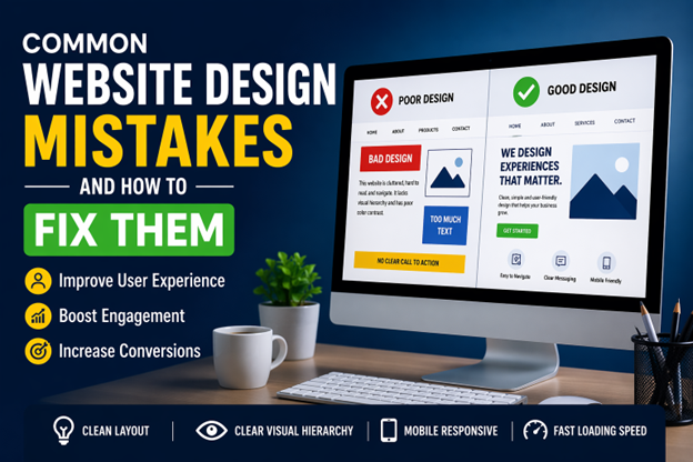
Too Much Going On Above the Fold
Above the fold just means everything a visitor sees before they scroll. It is the most valuable real estate on your entire website,e and a lot of businesses waste it completely.
A tech startup in Los Angeles once had their homepage hero section packed with a background video, an animated headline, five navigation links, a chatbot popup, a cookie banner, and a promotional banner all fighting for attention at the same time. Visitors were overwhelmed before they read a single word about what the company actually did.
The fix is ruthless simplicity. One clear headline. One supporting line. One button. That is genuinely all you need above the fold. Everything else can live lower on the page, where visitors who are actually interested will find it. The goal of that top section is not to show everything. It is to make someone curious enough to keep scrolling.
Fonts and Colors That Work Against You
This one sounds like a small detail, but it has a bigger impact than most people expect.
Light gray text on a white background looks elegant in a design file. In real life, on a bright screen or in sunlight, it is genuinely hard to read. Tiny font sizes feel modern and minimal until someone over 40 tries to read your services page on their phone. Decorative fonts look beautiful in a logo, but become a strain to read in paragraphs.
Good website design services in California always prioritize readability over style. Body text should be at least 16 pixels. The color contrast between text and background needs to be strong enough that anyone can read it comfortably. Decorative fonts belong in headlines only, never in the main content.
If someone has to work to read your website, they will just stop reading.
Contact Information That Takes Three Clicks to Find
Here is a mistake that loses customers at the very last moment. Someone has read your website, they like what they see, and they are ready to reach out. And then they cannot find how to contact you without hunting through the menu.
A legal firm in San Diego had their phone number only on the contact page, buried in the footer menu. Half their visitors were leaving the services page without ever finding it. Moving the phone number to the top right corner of every page and adding a contact button at the end of each service description doubled their inbound calls within six weeks.
Your contact information should be impossible to miss. Phone number visible in the header. A contact button at the end of every key page. An email address that is actually monitored. Do not make interested people work for it.
Stock Photos That Feel Fake
Visitors are much better at spotting stock photos than most business owners realize. The overly perfect handshake. The diverse team laughing around a laptop. The woman in a headset is looking delighted about customer service. People see these images, and something feels off even if they cannot explain why.
Real photos of your actual team, your actual workspace, and your actual products will always outperform stock images. Always. A slightly imperfect real photo builds more trust than a perfect fake one.
If a full professional photoshoot is not in the budget right now, even decent phone photos of real things are better than generic stock imagery. Website design services in California that take conversion seriously will push you on this point because the data backs it up consistently.
Slow Load Times Nobody Warned You About
A website that loads slowly loses visitors before they even see the design. Studies consistently show that if a page takes more than three seconds to load, a significant portion of visitors leave. On mobile connections, that number gets worse.
The usual culprits are large uncompressed images, too many plugins running in the background, and cheap hosting that cannot handle traffic spikes. All of these are fixable without rebuilding the entire site.
Run your website through Google PageSpeed Insights right now. It is free,e and it tells you exactly what is slowing things down and how to fix it.
A slow website is not a design problem. It is a business problem. Fix the speed, fix the mobile experience, make it easy to contact you. The rest follows naturally.