Responsive website design is the CURRENT and FUTURE because various studies show an increasing trend in mobile usage.
Data reports state that 60% of internet searches are conducted on mobile devices.
If your website lacks a good layout, loads slowly, and is not visually appealing, then don’t expect users to return to your site ever. Users take 0.05 seconds to see whether they should engage with this website or not.
Doing collaboration with a certified web development partner saves your time and effort by creating a responsive website that makes you stand out from others.
You will receive constant support from qualified professionals who possess relevant expertise in responsive web design services.
Such collaboration gets you more web visitors, skyrockets your conversion rate, and ultimately gives you more sales.
An Overview of Responsive Web Design
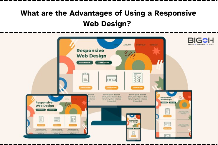
Responsive web design involves creating websites that work flawlessly on various devices, be it a tablet, smartphone, or desktop.
As responsive design uses CSS queries, it automatically adjusts according to different screen and window sizes.
Back in the 1990s, web designers used to follow a traditional web design approach. As they created websites with desktop users in mind, it was challenging for mobile users to access them.
However, in 2016, things changed with a sudden rise in mobile traffic. According to data reports, 50% of the website traffic is primarily mobile users.
There is no doubt in saying that an increasing number of smartphones gives rise to mobile app users.
Some website designers ignored this trend of making their websites mobile-friendly and responsive. This results in a loss of traffic and potential customers.
If you think of creating 2 websites for separate users – mobile and desktop – it would result in a waste of employee hours.
Data reports from Hit wise state that 60% of searches on Google are conducted using a mobile device.
Additionally, 74% of users intend to land on websites that look great on mobile devices. So, why not change your design approach by heading towards responsive web design.
A non-responsive website increases your bounce rate and decreases your conversions as visitors face challenges in reading your content. They have to zoom in or out many times to access the content.
Also, a non-responsive website affects your search engine rankings negatively because Google prefers ranking websites that are mobile-friendly.
7 benefits of Responsive Web Design
1. Cost-effective
Say goodbye to the hassle of creating multiple websites because a responsive web design helps you create and manage a single website that adapts to various screen sizes and devices.
In the past, creating multiple versions of websites using a traditional design process was a costly affair for businesses.
A responsive web design saves your development and maintenance costs as users can access your website on the go using any device, be it a laptop, desktop computer, or mobile phone.
You don’t have to pay separately for mobile and non-mobile audiences because a single site is enough for you to serve all visitors across different devices.
2.Enhances your user experience
With responsive web design, you can enhance your user experience as they can access your website across various devices.
They get an optimal viewing experience without needing to scroll or zoom in/out because the website content adjusts automatically to the screen size of the device.
Imagine a scenario where a user checks your website on a mobile device and finds that there was jumbled text and missing images on the website. The customer got frustrated and left the website, leading to a higher bounce rate.
An exciting example of a responsive website that enhances your user experience is Dropbox.
Dropbox uses responsive web design that looks different on mobile and desktop versions.
The company determined user intent by each device to offer a tailored experience to each user.
When you visit Dropbox’s website on web, you will see a small arrow that points you to scroll the page and read more content.
While, if you access the same website on a different device, let’s say a mobile phone, there won’t be any arrow.
It is assumed that users will scroll naturally when they access the website using a handheld device.
3.Increase your reach
Businesses can attract a wider audience by creating a responsive web design because, these days, most users are accessing websites using their mobile devices.
Responsive websites are adaptable because they use flexible grids to fit the content as per various devices and screen sizes. That’s why users get consistent experience across all devices such as tablets, smartphones and desktops.
For any business owner, the focus of creating a responsive web design is to target everyone be it mobile or non-mobile audiences. Therefore, a responsive website proves to be a game-changer for businesses, as one site can be accessible across all devices.
4.Lowers your bounce rate
Because a responsive website delivers great experience to users, visitors are most likely to spend time on your website.
While a website with higher bounce rate shows that people land on your website and instantly left it because of these 3 reasons –
- Pages are loading slowly
- Your website has poor UX design
- Content is not meeting user expectations
A responsive web design reduces your bounce rate as it enhances user experience across various devices, provides a better layout of your website, and loads faster.
A lower bounce rate signifies visitors are going to stick to your website for longer, visit more pages, and engage with your content.
5.Increases your conversion rates
Users that come to your website have high expectations from you and they want quick information.
Google says that more than 50% of the searches that happen on Google primarily include mobile users.
A non-mobile friendly site leads to an increase in bounce rate and visitors are 5x more likely to leave your website.
With traditional website design, it was challenging for people to view your sites on smartphones because content appeared to be stretched, and they faced challenges in navigating the website.
While a responsive web design follows a one-size-fits-all approach because these websites are simple to navigate.
Moreover, users can browse the products on the go and save their collections to cart. A business owner gets more sales because a single website is optimized for different devices.
6.Better analytics and reporting
A responsive website design drives more organic traffic, and with analytics, you can track how users are interacting with your website or from which sources traffic is coming.
Analyzing all these metrics helps you improve the performance of your website.
Because you don’t need multiple sites, Google Analytics makes it easy for you to consolidate all your data into a single report.
In the past, managing multiple websites was a cumbersome task as developers had to track user journeys, conversion paths, redirects, and funnels.
All of it will help you analyze how your content performs well on different devices.
When you get valuable insights about your audience’s behavior, you can make data-driven decisions that enhance user behavior.
7.Easy to maintain such websites
Managing various websites requires you to undergo additional testing and support.
Here, you have to double the efforts by creating two content strategies, separate web interfaces, and maybe hiring two separate design teams.
A responsive website follows a one-size-fits-all approach by adjusting content to all screen sizes.
It is a goldmine for designers, developers, and business owners, reducing their burden and saving their time.
It saves you on maintenance expenses as it is much easier to maintain one website than two different versions.
Wrapping up
A responsive website design has become an essential element for business owners as they can enhance their audience outreach.
Creating a responsive website provides multifaceted benefits such as cost-effectiveness, improves your conversion rates, lowers your bounce rate, etc.
If you are still stuck with a traditional website design, it’s high time for you to switch to a responsive, mobile-friendly website.
Such website design delights your customers by providing a seamless user experience. Moreover, your website content looks great across all devices.
On the contrary, if your website is not responsive, you will experience more bounces than conversions.
People these days have become impatient, and if your webpage takes too much time to load, they are going to leave it empty-handed.
The only way to increase your website loading time is to implement a responsive web design so that users won’t abandon you.