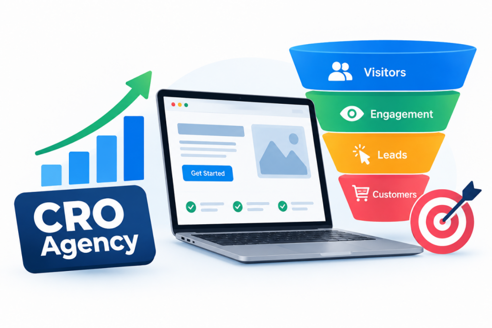
A business site can pull in loads of visitors, yet still not get the kind of outcomes the company hopes for. People might scroll through a few pages, checking out products or services, then just… vanish. No purchase, no message, nothing.
A big part of that is the customer journey. Visitors usually need a straightforward, convenient route from the moment they land on the site, to the moment they do what the business actually wants. If a company really understands how that journey works, it can spot weird friction, like pointless barriers or confusing page flow, and then shape an online experience that feels more aligned with what potential customers expect.
Start with a first impression that actually clicks
When visitors arrive, they should figure out fast what the business does. If the wording is messy or the page is cluttered, it becomes harder for people to decide if they are in the right place. A solid headline, tidy navigation, and content that’s organized can help people locate the right info without headaches.
Also, think about where visitors are coming from. Someone landing from an ad might expect something different than a person reading a blog post, for example. Each key landing page should offer enough context so visitors can naturally decide what comes next, without having to hunt around for clues.
Guide visitors toward the next thing, not the wrong thing
A proper customer journey should feel smooth, not like a maze. People shouldn’t have to spend ages searching for a contact form, the right product section, pricing details, or a checkout button.
Clear calls to action can nudge visitors along and reduce uncertainty. What the CTA should be depends on the business, but it has to be obvious, and easy to spot.
If a business wants a deeper look into how people interact, working with a cro agency uk can help analyse visitor behaviour and point out openings to improve that path from first interest into conversion.
Remove the extra steps you don’t need
Every extra step in any flow adds a new chance for someone to bounce. So it’s worth reviewing forms, checkout pages, sign-up routes, and other key moments along the way.
For instance, a contact form that asks for too much information can put people off. And an online checkout that uses multiple pages might make buying feel overly heavy for something that should be quick and simple.
Still, reducing steps doesn’t mean cutting out useful info. The real aim is to make each interaction efficient, while keeping the details customers actually need, and not more than that.
Make it work on different devices, always
The customer journey should feel consistent whether someone is on a laptop, a tablet, or a smartphone. A page that looks great on a big screen can suddenly turn annoying on mobile, with buttons that are too small or menus that do not behave.
Businesses should test important pages across different screen sizes. Buttons, menus, forms, images, and text should stay easy to use, without requiring unnecessary zooming or nonstop scrolling. Mobile performance matters a lot too, especially when people find a business through social media, search results, or digital ads.
Conclusion
Building a better customer journey comes down to understanding what visitors need at each stage of their experience. Clear messaging, sensible navigation, helpful calls to action, and streamlined processes all make it easier for people to move forward.
And when businesses review the customer journey regularly, then remove the unnecessary hurdles, they can create a website that offers a better experience, while also supporting goals like sales, enquiries, and registrations.