If you think about how most apps work, they’re pretty predictable.
You open one, scroll a bit, maybe tap something, and then you’re done. That pattern hasn’t really changed in years. It’s familiar, but it’s also a bit… stale.
Lately though, there’s been a quiet shift. Not something you notice instantly, but it becomes obvious the more time you spend with newer platforms.
Some apps no longer wait for input in the usual way. They’re already active. Already updating. You step in, interact, and things respond immediately.
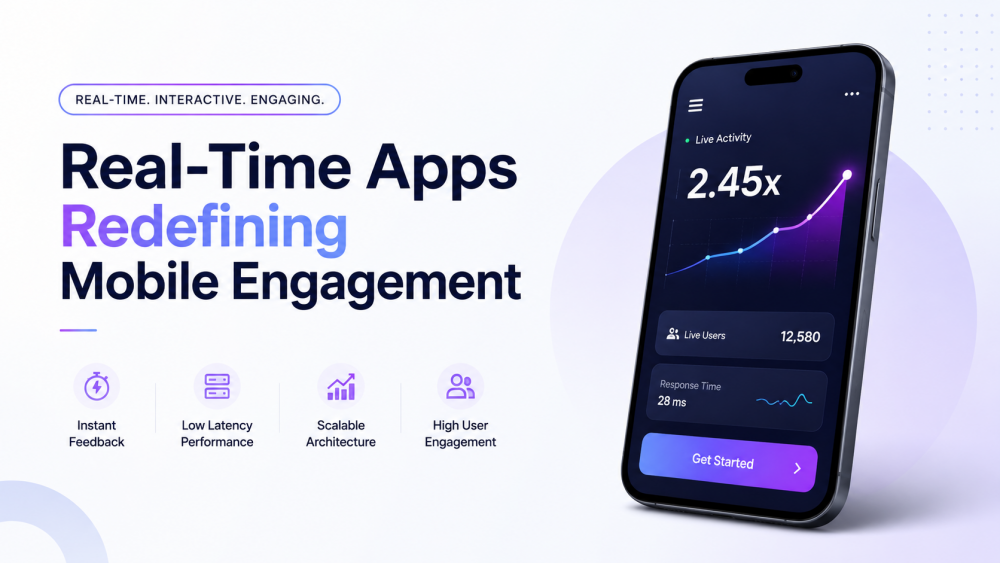
This shift is closely tied to how real time interactive apps are being built today. The focus is no longer just on features, but on responsiveness, flow, and how quickly systems react in the moment.
What Makes These Apps Feel Different
It’s not just about speed, even though speed is a big part of it.
The real difference is that these apps don’t feel like tools you operate. They feel more like environments you drop into.
There’s no clear beginning. No “start here” moment.
Things are already moving. You react to them, and they react back immediately. That back-and-forth happens so quickly that you stop noticing the mechanics behind it.
After a while, it doesn’t feel like interaction anymore. It just feels… continuous.
And that’s where things start to change.
Why People End Up Staying Longer Than Planned
You’ve probably seen this yourself.
You open something just to check it quickly, and a few minutes later, you’re still there. Not because you decided to stay, but because leaving didn’t really cross your mind yet.
That’s not an accident.
These apps remove the small pauses where people usually drop off. No waiting for pages, no thinking about what to do next, no friction that gives you a reason to exit.
Instead, it becomes a simple loop.
- You do something.
- You see what happens.
- You either go again or stop.
- Most of the time, people go again.
Not because they’re forced to, but because it feels like the natural next step.
What’s Happening Behind the Scenes
From the outside, everything looks smooth. Almost effortless.
But that usually means a lot is happening underneath.
Keeping things in sync while multiple users are interacting at the same time is not as simple as it sounds. Especially when everything needs to update instantly.
Most systems handling this rely on constant connections rather than the usual request-and-response pattern. Data moves continuously instead of waiting to be asked for.
Even then, it’s a balancing act.
If there’s even a slight delay, people notice. Maybe not consciously, but enough to feel that something is off.
And once that feeling creeps in, the experience starts losing its grip.
Design Is Doing More Work Than It Gets Credit For
One thing that stands out with these apps is how little they try to show.
There’s not much clutter. Not many options. Not a lot to “learn.”
That’s intentional.
When everything moves quickly, users don’t have time to figure things out. The interface has to make sense almost instantly.
So instead of adding more, designers remove things.
What’s left is usually just enough to guide the interaction without getting in the way.
You don’t notice good design here. You just feel comfortable using it.
Making Money Without Breaking the Flow
This part is tricky.
A lot of traditional monetization methods don’t fit well in these kinds of apps. Interruptions, especially obvious ones, can break the experience.
And once that happens, people tend to leave faster than they arrived.
So the approach is different.
Instead of forcing decisions, these apps usually offer small upgrades or enhancements that sit inside the experience. Things that feel optional, not necessary.
Users who want more can opt in. Others just continue as they are.
It’s quieter, but it works.
Where Things Start Getting Complicated
Everything feels manageable at the beginning.
Fewer users, predictable behavior, not too much happening at once.
Then growth kicks in.
More people join. Activity increases. Things start happening at the same time instead of one after another.
That’s when the cracks can appear.
Keeping everyone in sync becomes harder. Small delays start showing up. Edge cases that didn’t exist before suddenly matter.
It’s not that the system stops working. It just becomes harder to keep everything feeling smooth.
And fixing that is not always straightforward.
Why Some Apps Get It Right and Others Don’t
If you strip everything down, the difference isn’t always about features or design trends.
It usually comes down to how the experience feels moment to moment.
The apps that work well tend to do three things without drawing attention to them:
- They respond quickly
- They don’t interrupt the flow
- They make it obvious what’s happening
Miss one of these, and the experience starts feeling heavier than it should.
And once it feels heavy, people start dropping off.
What This Might Turn Into Next
You can already see small hints of where things are heading.
Some apps are starting to adjust based on how people use them. Not just what they tap, but when they hesitate, how long they stay, what they repeat.
It’s subtle for now.
You won’t always notice it unless you’re paying attention. But interactions feel slightly smoother over time, almost like the app is adapting quietly in the background.
Nothing dramatic yet. Just small shifts.
But those small shifts tend to add up.
Final Thought
What makes these apps stand out isn’t just speed or technology.
It’s the absence of friction.
There’s nothing slowing you down, nothing forcing you to stop and think too much. You move through the experience without noticing the transitions.
And once you get used to that, going back to slower, more rigid apps feels a bit frustrating.
Not broken. Just… harder to stay in.