It often happens that when you see the photo you took, you realize that something’s missing. Not in the sense that it’s unnatural, but more like not really capturing your feelings. The scene itself might be breath-taking but still failing to convey what you felt about it the moment you took it.
Well, here’s the solution – editing. Most people would frown at this point claiming editing is cheating and distorting the natural beauty of the scene or object, but once you start scratching under the surface of the editing possibilities of digital photography, you discover ways of subtle adjustments and tweaks that can add magic to your work.
Adjust HSL for more natural colours
HSL is short for Hue, Saturation and Luminance, and this tool can help you change colours more precisely. For instance, the photos sometimes show extremely pale skin or add a crazy shade of orange to it, and it’s right here that HSL can help you get it back to normal.
This tool controls the skin tones and guides you through the spectrum on both sides of orange. Dragging it far left will create the effect of sunburnt skin and in the opposite direction, you’ll get yellowish skin. Saturation control the colour intensity so if you go low, the skin will appear ghostly and pale, and if you over-saturate it, the face will appear too orange and suntanned.
Finally, luminance focuses on the light intensity of one particular colour. The lower you set the luminance, the darker the skin colour will be. The higher you set it, the brighter will the face seem. An expert tip is to adjust the HSL for Orange to colour correct skin tones and to Blue to do the same for the sky.
As an innovative master’s degree in photography teaches, this is no longer just a simple craft, as photography allows you to create a model of the world by relying on your ability to not just see the world, but narrate it and interpret it in the best way possible, and with proper editing tools, you can do exactly that.
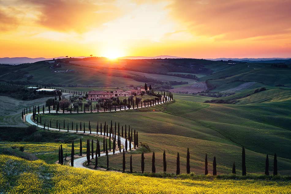
Add more warmth with fine temperature adjustment
Temperature determines how cool or warm the photo feels. If you pull it to the right, the photo will appear warmer like the tones you see in the late afternoon sun. Pulling it to the left, you’ll get a photo looking much colder just as the snow-capped mountains appear.
On the other hand, adding tint will change the amount of green and pink. By pulling it to the right, you’ll enhance the pink hues such as you see in a fiery sunset, but if you pull it to the left, you’ll boost the green hues and get the effect of a lush green jungle forest.
This is all important because the camera sometimes fails to capture the White Balance properly. You have probably seen gorgeous blazing sunsets with your eyes, but then you go through your photos and all you see is bluish and flat images of sunsets. By adjusting the tint and temperature while editing your photos, you’ll make an enormous difference in your sunset photos and give them back all the natural warmth that they naturally have but the camera failed to capture.
Play with RGB tone curves
The RGB or red-green-blue tone curves are surely the best-kept secret of photography editing! This tool is certain to make a difference and allows you a lot of room to play. Depending on how you set your camera, your photos can come out looking slightly duller or with more contrast than in the reality.
The RBG is the default within the tone curve for all colours, but what you can do is to set the curve for each colour separately. Playing with this will help you add more depth to your images. It’s recommended you start with 5 or 6 points and then adjust the left side of the tonal curve, the one that covers mid to dark side. This will show you how the mid-tones and shadow change so you can decide what the best choice would be.
Avoid these three mistakes
Everyone goes through the process of trial and error, and mistakes naturally happen especially in the beginning. But, as you learn and develop your skills, you’ll find out these three to be the top moves to be avoided.
Let’s start with over-saturation. Use the HSL tab to decrease the saturation so the skin looks more natural and the trees in the landscape lose that neon green hue.
Intense contrast is another pitfall to avoid. Combining bright highlights with extremely dark shadows will also make your photo look unnatural. You should play with contrast tabs and shadows and highlights, just make sure you control it and use RGB tone curves to strike that perfect balance of natural contrast.
Finally, take an objective viewpoint when it comes to what is a natural hue and what is not as certainly orange skin, cyan blue skies and dull grey grass are not. At the slightest sign of funky colours, use the Hues tab to make adjustments until the picture looks as natural as possible.
Using these editing tips, your own intuition and creativity, you can play with tones and colours, and just like a painter, express your emotions through your photography. There’s no obligation any more to share what the camera initially captured allowing you to freely depict your vision. As your editing style evolves, you’ll be discovering new tricks and techniques that will enable you to edit your photos but still honour all the beauty of the original picture.
Author’s bio: Jennifer Hahn Masterson is the Lead Content Strategist at Spread the Word Solutions, holding an MA degree in business communication. She is always doing her best to help her clients find their place in the ever so competitive business arena, insisting on long-term sustainability rather than on some questionable get-rich-fast scheme. You can check her out on LinkedIn.