Typography has two purposes in web design. The first is to increase comprehension, and the second is to help convey a design’s meaning, style, and mood. It is the skill of organizing letters and phrases so that the reader can easily read, understand, and find the content visually pleasing.
Typography focuses on style, appearance, and structure, intending to evoke particular feelings and communicate specific messages. In other words, the font brings the words to life.
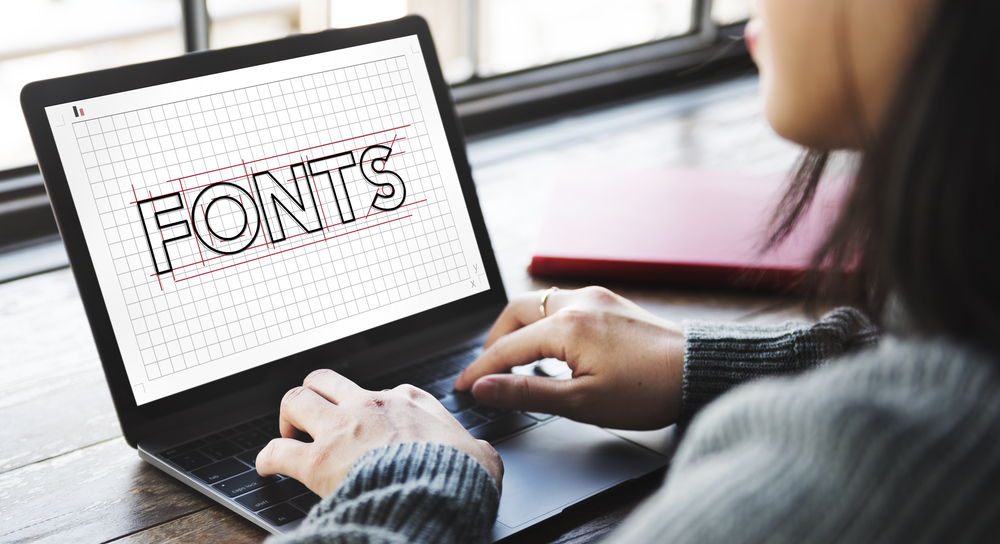
Options for Fonts
Typefaces convey several meanings and values, all of which should align with your brand’s message as a whole. Therefore, you must ensure the fonts you choose for your website are web-safe and easy to read. You must use a web-safe font to communicate your brand effectively across all browsers and platforms.
Choosing the appropriate font can be aided by being aware of the four main typographic styles:
- Serif and sans-serif typefaces
- Script fonts
Fonts apt for display include script, serif, sans-serif, and a combination. Understanding the graphic distinctions between serif and sans-serif typefaces is the first step. Typeface distinctions between serif and sans-serif styles. Unlike sans-serif fonts, serif typefaces contain a catch at the end of each letter.
Serif and sans-serif typefaces can be used for various designs and goods. Sans-serif typefaces are highlighted in large, bold titles, whereas serif fonts are easily visible in smaller writing.
Consider display and script fonts, two popular fonts categories. They are rarely used than serif and sans-serif typefaces. They are difficult to read in the body copy or text smaller than 14 points.
Script fonts are used as ornamental elements. A script is excellent for collecting quotes, composing headlines, or simulating hand calligraphy.
Why Do You Need to Pay Attention to Typography?
These are the top reasons for selecting the right typography:
Brand Recognition
Your website will be better if you employ a consistent typeface pattern and present it rhythmically. Typography identifies your company and gives viewers a way to recognize it.
Typography can also be utilized to establish the values and tones of a brand. Depending on what they do and what they stand for, each typeface can represent businesses in multiple ways.
Level of Expertise
Using the appropriate text type and size will increase your customers’ likelihood of believing you. Having a business-focused website will help with product marketing.
The originality of typographic design is offered. Your design or web pages appear pleasant or high-end, playful, serious, or appealing due to the clever use of fonts.
The core of a professional design approach is typography. Typography establishes the worth of the information you provide, and clients believe in the knowledge they see on your website.
Decide the Viewer’s Mood
One example of content might be a video game commercial. It might contain some of the most intriguing elements of the game. In this case, you should produce engaging, dynamic, and stylish content.
The designer’s choice of text alignment and arrangement has a significant impact on the readability of the content. The font has typically been oriented by designers in one of four ways: right, left, centred, or justified.
You should choose clear, professional typefaces if your writing needs to be taken seriously. The typeface that is used affects how the text is read.
Readability
A web page’s H1 heading should be in a larger font at the top since it is more noticeable. The size of the H2 heading, H3, H4, and so on will all shrink. The reader may see from this hierarchy what information they need to see and what material is necessary to support it.
Facilitates Communication
A website may be about a business, art pieces, or any particular product. You can instantly tell what kind of information a website gives when you visit. The way the information is arranged, the fonts and colours used, and other minor details enable communication between the website owner and the visitor.
Now that you know how crucial typography is to design, let’s talk about the top 5 fonts for websites. Before we continue, it is crucial to remember that many of the top web design typefaces are freely accessible online. The best font websites are often Adobe, Google, and Microsoft.
If you have little knowledge on how to use typography, contact a professional web development company in UK to guide you through it.
5 Best Fonts For Websites
Typography is a significant design component that enhances the material you provide. So, here are the 5 best fonts that are readily available online.
Open Sans
A superbly written, impartial, and simple font option is Open Sans. One of the best sans-serif fonts for readability and user experience (UX) is this one. Open Sans is a reliable solution for the majority of situations and performs best for companies that place a high priority on consistency and dependability.
In 2020, Open Sans will be used to create some of the top websites. Font style that can be used includes sans-serif Montserrat, Lato, Brandon Grotesk, and Roboto. You can use Adobe Fonts to download Open Sans.
Montserrat
Montserrat is another one of the top web fonts available. A geometric sans-serif typeface called Montserrat is simple to use almost everywhere on your website. This font scales nicely since it is readable in both large and small sizes.
This strong, modern font has a tendency to appeal to the millennial generation. This typeface works wonderfully along with Open Sans, Roboto Slab, and Lora. You can visit Adobe Fonts to obtain Montserrat.
Roboto
A geometric sans-serif typeface with open curves is called Roboto. It is employed in both situations because it is regarded as a welcoming and competent typeface. Plus, Roboto is the standard font on Google services like Android. Compatible fonts include Roboto Slab, Open Sans, Lato, and Playfair Display. Just like the previous ones, you can use Adobe Fonts to download Roboto.
Playfair Display
Playfair Display is a serif typeface with hints of femininity and an appealing, contemporary feel. For websites targeting women, this typeface is the ideal option. The more aesthetically beautiful this font is by nature, the lower the weight. It pairs well with Georgia, Montserrat, Roboto, Lato, and Open Sans. Playfair Display can be downloaded using Adobe Fonts.
Lato
Originally designed for corporate use, the sans-serif font Lato remains effective for such websites. It exudes great professionalism while feeling cozy and welcoming. It is a fantastic options to give brands a contemporary and approachable feel, especially for those that operate in industries like banking and accounting. It works well with Playfair Display, Roboto, Open Sans, and Montserrat. You can get Lato via Adobe Fonts.
Final Words
Often, typography is overlooked even though it has an essential component in user interface design. It will help you build an excellent website to achieve your business goal by making you a brand. If you need help figuring out where to start, you can check websites like Design Gravity and get their assistance in getting an effective design.