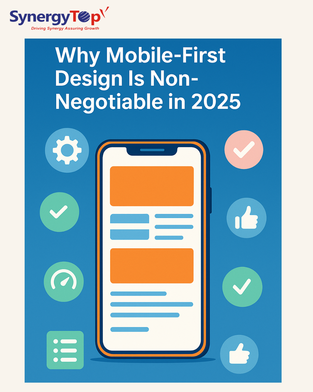
We’re halfway through 2025, and it’s hard to ignore one thing: everyone’s browsing the web from their phone. In fact, mobile traffic accounts for more than 70% of global visits. Still, many websites feel clunky or unusable on smaller screens—and that’s not just frustrating, it’s costing businesses real opportunities.
Let’s be honest—when was the last time you opened a desktop just to check out a website?
If someone lands on your site from their phone and things don’t load right or buttons are hard to tap, they’re gone. You don’t get a second chance.
There’s a popular quote from Steve Jobs that feels fitting here: “Design is how it works.” These days, if it doesn’t work on mobile, it just… doesn’t work.
From Desktop-First to Mobile-First
Not long ago, websites were built for big screens first, then “made responsive” for mobile as an afterthought. That approach just doesn’t cut it anymore.
Since Google rolled out mobile-first indexing back in 2018, your site’s mobile performance is now front and center. It’s what Google sees first—and ranks you by. That shift didn’t happen overnight, but it’s definitely here to stay.
Whether you’re running an online store, building an app for students, or offering healthcare tools—your mobile interface is likely the first (and sometimes only) impression you’ll make.
Where Google Ranks You Comes Down to These 3 Things
Google uses what it calls “Core Web Vitals” to figure out whether your website gives people a smooth experience. While that might sound technical, it really boils down to:
- LCP: Does the main content show up quickly?
- FID: Can users interact without delay?
- CLS: Is the layout stable, or does stuff shift around?
These may seem like small details, but they have a big influence on how people (and search engines) treat your site. And guess what? Poor scores usually come from slow, bloated mobile pages.
A mobile-first approach naturally improves these areas by cutting unnecessary stuff and focusing on what actually helps your visitor.
Step-by-Step Guide to Implementing Mobile-First Design
1. Sketch the Mobile View First:
Don’t jump straight into Figma or code. Grab a pen. Paper works best. Sketch what someone really needs to see when they land on your homepage from their phone.
No fancy animations. No bloated carousels. Just the core stuff—your main message, a clear button, maybe an image if it adds value. That’s it. You’ll be surprised how much you don’t need. Think of it like packing for a trip and realizing half your suitcase stays untouched.
2. Use a Framework:
Tailwind, Bootstrap, even just CSS Grid—they all help make your site play nice with screens of all sizes. They’re not magic, but they save time and stop you from wrestling with media queries all day. That said, don’t let the framework steer the whole ship. Build around your content and your audience. Use the tools—but don’t let them flatten your brand’s personality.
3. Clean Up Your Navigation:
Menus that look fine on desktop often turn into a mess on mobile. Dropdowns stacked inside dropdowns? Nobody has time for that.
Stick to what works:
- A simple hamburger menu
- Sticky bottom tabs
- Clearly labeled buttons big enough to tap with your thumb
And double-check that links aren’t sitting too close together. If your visitor has to zoom in to click something, they’re already annoyed.
4. Make Speed a Priority, Not an Afterthought
Mobile users don’t wait. If your site hangs for more than a couple of seconds, they’re gone.
Here’s a quick reality check:
- Are your images oversized?
- Using 10 fonts when 2 would do?
- Got scripts loading that you don’t even use anymore?
- Run a speed test. Kill the fluff. Keep the essentials. Mobile-first also means minimal, in the best way possible.
5. Actually Test on Real Devices:
What looks great on your Desktop might completely fall apart on an old Android or a mid-range iPhone. So test it—on real phones. Use your team’s devices, or buy a few second-hand ones for QA. Tap, scroll, switch networks. Catch the stuff users will notice before they do.
This one step alone can save you a lot of awkward user complaints later.
6. Launch It—But Don’t Walk Away
Going live is just the beginning. Once your site’s out in the wild, keep an eye on how people are actually using it. Are users clicking where they’re supposed to? Are they scrolling past important content? Are they converting or just bouncing?
Use tools like Hotjar, Clarity, or even just good old Google Analytics to get answers. Don’t assume. Watch. Then tweak.
Conclusion:
Wrapping It Up
The truth is, mobile-first design isn’t a nice-to-have anymore—it’s just how smart businesses build for the web in 2025.
It’s not about chasing trends or checking boxes. It’s about meeting people where they are—on their phones, scrolling, tapping, searching. Whether you’re redesigning a legacy site or launching something new, putting mobile first keeps you aligned with both your users and search engines.
We’ve seen this shift firsthand with clients: better engagement, faster load times, and fewer bounces—just by rethinking what matters most on small screens.
So, if there’s one thing to take from all this, it’s this: don’t design for mobile last. Design for mobile first—and scale up from there.
At SynergyTop, we specialize in building mobile-first web and app experiences that meet modern user expectations and business goals. Explore our UI/UX design services or get in touch with our experts to start transforming your digital presence today.
How is your digital experience meeting the expectations of mobile-first users in 2025—and what will you do next to improve it?