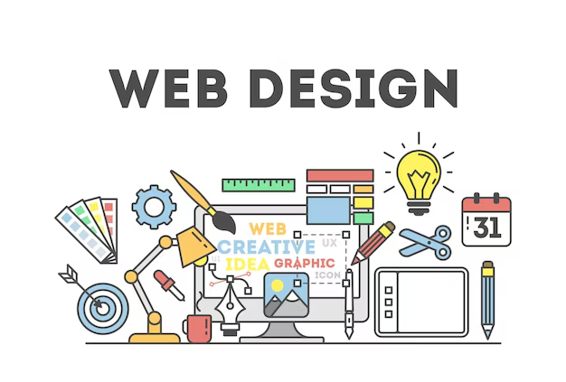
Website design shapes how billions of people experience the internet every single day. Yet most businesses still treat it like decoration rather than strategy. Think about the last time you instantly left a website. Was it the slow loading? The confusing navigation? The walls of text that made your eyes glaze over? Your visitors make these same split-second decisions about your site right now. The difference between a site that converts and one that repels visitors often comes down to fundamental design principles.
Why Purpose Drives Every Pixel
Your web design must have a clear purpose. Always. Before you pick a single color or font, ask: What should this site do? Sell products? Generate leads? Share knowledge? Build community? The answer shapes everything. A blog’s website design looks wildly different from an e-commerce store’s. A portfolio site needs a different flow than a nonprofit donation page.
Purpose isn’t vague. It’s specific. It’s measurable. “We want people to sign up for our newsletter” is better than “We want engagement.” “We want visitors to book a demo” is better than “We want conversions.” This clarity guides your entire web design process.
Here’s how to nail it:
- Talk to your real customers. What do they need? What confuses them?
- Map out the exact steps you want your visitors to take. Click a button? Or fill a form? Call a number?
- Test relentlessly. Does your web design make those steps obvious?
- Without purpose, your web design is just decoration. And decoration isn’t enough! .
The 3-Second Rule: How First Impressions Dominate
Visitors decide whether to stay or leave in less than 3 seconds. That’s before they even read a word. What makes them stay?
- Clear value proposition (What’s in it for them?)
- Visual hierarchy (Their eyes should know where to look first.)
- Trust signals (Reviews, logos, security badges)
If your homepage is a wall of text or a confusing mess, they’re gone. For example, look at Apple’s website design. Minimal text, bold visuals, and a single clear CTA.
User Experience Basics In Website Design
Great web design puts people first. Always. It’s not about what you like. It’s about what they need. User Experience (UX) is how easy and enjoyable it is for someone to use your site. It’s the difference between a smooth highway and a tangled alleyway.
People won’t hunt for what they need. They’ll leave. Fast. Your job is to make the path obvious. Intuitive. Effortless. Navigation must be crystal clear. Menus should make sense at a glance. Important actions like “Buy Now” or “Contact Us” need to stand out. Don’t make users think. Guide them gently.
Next, mobile optimization is essential. Over 60% of web traffic comes from phones. Your web design must work flawlessly on tiny screens. Buttons need to be big enough to tap. Text needs to be readable without zooming. Pages must load in under 3 seconds. If it’s clunky on mobile, you’re losing most of your audience.
Accessibility matters too. Everyone should use your site. People with visual impairments. People using screen readers. People with motor difficulties. Simple things like alt text for images, clear color contrast, and keyboard navigation make a huge difference. Good website design includes everyone. It’s not just ethical. It’s smart business.
The F-Shaped Reading Pattern (And How To Use It)
Studies show people scan websites in an F-shaped pattern. They read the top horizontal line. Then scan down the left side. Finally, skim the rest.
What this means for your design:
- Put your most important info in the top-left.
- Use subheadings to guide the eye.
- Keep paragraphs short (2-3 lines max).
- If your key message is buried at the bottom, no one will see it.
Visual Design: The Clickbaity Factor
Visuals grab attention. But great website design uses them strategically. Color, typography, imagery, they all send messages. They evoke emotions. They build trust. Or they destroy it.
Choose colors wisely.
- Blue feels trustworthy (think banks).
- Green feels natural (think eco-brands).
- Red creates urgency (think sales).
Stick to a limited palette: 2-3 main colors max. Too many colors look chaotic. Unprofessional. Your colors should reflect your brand personality. Consistently.
Typography is critical. It’s not just about fonts. It’s about readability. Sans-serif fonts (like Arial or Helvetica) are usually best for screens. They’re clean. Easy to read. Avoid fancy scripts for body text. Size matters too. 16px is the minimum for body text. Line spacing should be generous. Short paragraphs. Whitespace is your friend. It gives the eye a place to rest.
Imagery must be authentic. High-quality. Relevant. Use real photos of your team, your products, and your customers. Show, don’t just tell. Videos can be powerful, too. Short explainer videos. Customer testimonials. But only if they add value. Visual hierarchy is key. What do you want people to see first? Second? Third? Use size, color, and placement to guide their eyes. The most important thing should be the most prominent. A good visual design feels balanced. Calm. Purposeful.
The Power Of White Space (Why Less Is More)
Cluttered sites = overwhelmed visitors.
Look at the website design of Google’s homepage. One search bar. That’s it. Simplicity wins. White space (or negative space) isn’t empty; it’s a tool.
- It improves readability
- It draws attention to key elements
- It makes your site feel premium
Mobile Responsiveness: The Non-Negotiable In Website Design
Desktop dreams are outdated. Mobile rules now. 55% of traffic? Phones. Ignore that, and you lose half your shot. Responsive web design adapts seamlessly. One code. Many screens.
- Why the rush? Users expect it. Google’s mobile-first index punishes laggards. Rankings dip. Traffic follows.
- Start with breakpoints. 320px for small phones. 768 for tablets. Fluid grids scale images. Touch targets big enough for thumbs.
- Test rigorously. BrowserStack simulates devices. Fix overlaps. Speed dips. Voice search rising? Optimize for it.
- Moreover, AMP pages accelerate loads. News sites swear by them. Your turn for e-comm or blogs.
In essence, mobile isn’t extra. It’s core. Make your web design fluid. Users stay. Conversions climb.
Speed And Performance Optimization Essentials
Slow sites kill the goals. 53% of users bail if the load takes more than three seconds. Ouch. Fast website design keeps them. Compress images. WebP format shrinks files 30% without loss. Lazy loading defers off-screen bits.
Caching speeds repeats. CDNs distribute globally. Cloudflare handles this cheaply. Minify code. Remove whitespaces. Uglify JS. Tools automate it. Measure with PageSpeed Insights. Scores guide fixes. Aim for 90+.
Recent trend? Core Web Vitals. Google’s metrics track engagement. Largest Contentful Paint under 2.5s. Nail it for SEO wins. Performance isn’t a techy side quest. It’s user courtesy. Fast sites rank higher. Convert better. Invest here.
Partnering With A Web Design Company For Results
Sometimes, DIY isn’t enough. Complex sites need complex solutions. That’s where a web design company comes in. They bring expertise you might lack. They save you time. They handle the technical headaches.
A good web design company doesn’t just make things look nice. They solve problems. They ask the right questions. They understand your business goals. They make a website that works for you. Not just a pretty template. They know the latest trends, tools, and best practices. They test rigorously.
Professional web design is an investment. Not an expense. It’s the difference between a site that fades into the background and one that drives real results. Look for a web design agency that communicates clearly. That shows real case studies. That understands your industry. That focuses on outcomes, not just aesthetics.
Don’t choose the cheapest option. Choose the one that delivers value. A poorly built site costs more in lost sales and repairs than a quality build upfront. Professional website design pays for itself by attracting and keeping customers.
Signs Of Professional Web Design Excellence
Not every web design service is the right fit for your vision. You should be well-versed to spot excellence fast. Intuitive nav. No dead ends. Fast interactions.
- Security baked in. HTTPS standard. Forms encrypted.
- Analytics integrated. Track what matters. Bounce rates. Time on page.
- Scalable architecture. Easy updates. No rebuilds for tweaks.
- Updates reflect now. PWAs for an app-like feel. Dark modes for eyes.
- These markers? Your checklist. They define professional web design.
Accessibility And Inclusivity In Modern Website Design
Accessible website design isn’t optional anymore. It’s legally required in many jurisdictions. More importantly, it’s the right thing to do. About 15% of the global population has some form of disability. Never overlook cognitive accessibility.
Screen readers need a proper HTML structure to navigate your site. Use semantic elements like header, nav, main, and footer. Add descriptive alt text to all images. Make sure forms have proper labels. These basics help blind users understand your content.
Keyboard navigation matters for users who can’t use a mouse. Every interactive element should be reachable via keyboard. Focus indicators should be clearly visible. Skip links let users jump past repetitive navigation.
You must be aware of color blindness. It affects 8% of men and 0.5% of women. So, do not solely depend on color to convey information. Use patterns, labels, or icons as additional indicators. Never miss testing your designs with color blindness simulators.
Measuring Success In Your Website Design Efforts
Execution without monitoring the results means shooting in the dark. You must be aware of what you’re getting out of your efforts. That’s how you really achieve professional web design. Launch isn’t the end. Measure to improve. Google Analytics tracks basics. Sessions. Sources.
- Heatmaps reveal clicks. Where users drop off.
- Surveys ask directly. “What frustrated you?”
- A/B test changes. Headlines. Buttons. See lifts.
- Benchmarks guide. Industry averages. E-comm? 2-3% conversion good start.
- Iterate quarterly. Data drives. Your web design evolves.
Future-Proofing Your Investment
The web moves fast. New devices emerge. User expectations shift. Search engines update algorithms. Your web design needs to adapt. Think about future content. Will your web design handle more pages? More products? More blog posts? Scalability matters. A site that feels tight now might feel cramped in a year. Plan for growth.
Sustainability is rising in importance. Energy-efficient coding. Optimized assets. These reduce your carbon footprint. They often improve speed, too. Smart web design considers the bigger picture.
Keep Building Better!
Your website is alive. It breathes. It grows. It changes. Website design is an ongoing commitment. The major sections we covered…purpose, UX, visuals, tech, content, testing…they all are your foundation. Master them. Build on them.
Don’t settle for “good enough.” The web rewards those who care. Who put people first. Who test and learn. Who make every pixel count. Your web design is your most powerful business tool. Treat it like one.
What’s your next move? Audit your current site. Is it working for you? Or against you? Find one thing to improve this week. Speed. Clarity. A single confusing button. Fix it. Then fix the next one. Small steps build amazing sites. Start now. Your audience is waiting.