You see, UX for delivery apps isn’t just about looking nice. Far from it. It’s about what happens in that tiny window between opening the app and pressing “Place Order.” Miss a beat, and users vanish. Poof. Gone. And honestly, that’s the reality for a lot of new Deliveroo Clone UX attempts. People judge faster than you think. In the UAE, where expectations are sky high, slow or confusing experiences aren’t tolerated.
Some entrepreneurs assume flashy features equal success. Not true. You can have all the bells and whistles, but if the ordering flow trips up your users, none of it matters. This is why mobile app design UAE needs to anticipate behaviour before users even know what they want.
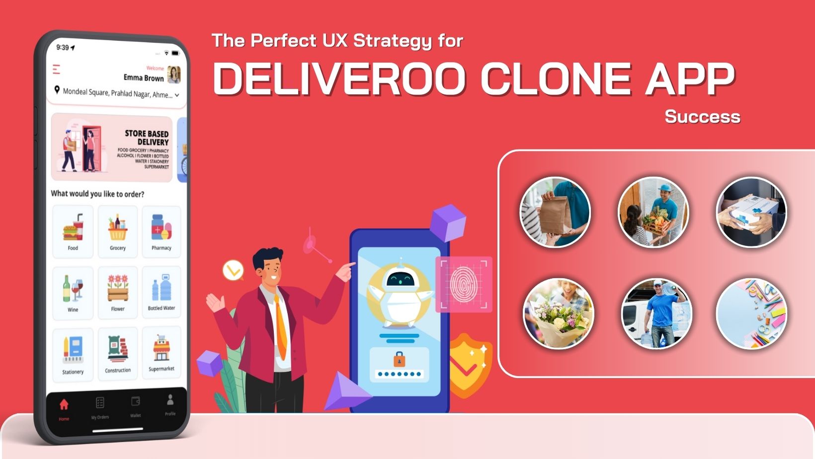
Why UX Defines Success in Delivery Apps
Let’s break it down. People skim. They tap. They swipe. Rarely do they pause to read. So your app has to move at their speed. Every extra tap? A potential drop off. Every extra screen? Friction. Friction equals hesitation. Hesitation kills conversions.
You want your users to feel almost invisible as they move through the app. Ideally, they open it, spot what they need, add it to the cart, and complete the order in seconds. Minimal thought required. That’s the goal of any food delivery user experience worth its salt.
Small cues matter too. Progress bars, estimated delivery times, confirmation notifications, these are the little nudges that build trust. Users notice. They feel reassured. And that subtle reassurance can make the difference between a one time order and a loyal customer.
Speed vs Simplicity: Designing Intuitive Flows
Here’s a common trap: more features = better UX. Nope. Clutter confuses users. It slows them down. Order flow optimization is about stripping the app to essentials. Clear purpose for each screen. Buttons guiding, not distracting.
Filters and categories help users find what they want without scrolling endlessly. Highlight popular items. Suggest options based on past behaviour. Let the app feel invisible but helpful.
Consistency is key. Users like predictable layouts. Familiar gestures. Icons where they expect them. It may seem minor, but when you’re competing in a market like the UAE, it’s everything. Misplaced buttons or inconsistent layouts? Users won’t forgive that.
Checkout Optimizations That Reduce Drop offs
Checkout. The point where dreams either convert or crumble. Users are impatient. Busy. Easily distracted. A clunky checkout wipes out all earlier effort.
Some tactics that work:
- Keep it minimal. Multi step? Forget it. One page is ideal.
- Auto fill addresses, payment methods, preferences. Make typing optional.
- Handle errors immediately. Payment fails? Show alternatives. Item unavailable? Suggest similar options.
The goal is simple: respect the user’s time. Every second shaved off the checkout increases conversion. And yes, smoother checkout flows mean fewer support tickets. Less hassle, happier users.
Personalization & Repeat Orders
People love recognition. Even apps. A Deliveroo Clone UX that remembers past orders, highlights favourites, or suggests relevant items encourages repeat purchases without feeling pushy.
You don’t need complex algorithms. Saving multiple addresses, preferred payment methods, surfacing deals, small touches count. Users feel known. And habits form. They return because the app “gets” them. Repeat business, built subtly.
When You Test The App, Ensure That You Consider HUMAN Users
UX isn’t static. People change, habits shift. Continuous testing is essential. Watch where users hesitate. Notice which flows cause friction. Try small A/B tests: move a button, tweak a menu order, and change a highlight. Little changes can yield huge insights.
Accept imperfection. Not everything works first try. UX is as much art as science. Observe. Listen. Adjust. Human centered design is iterative.
The Ripple Effect of Great UX
Good UX creates trust. Users feel confident. They return. Recommend the app to friends. Engage with new features. Conversion, loyalty, growth, it all starts here.
Operational benefits? Plenty. Fewer errors, smoother communication with drivers and merchants. The system just works. Users might not see the backend improvements, but they feel them in speed, ease, and reliability.
Your Users Are People, So Your App Should Be Designed For Them
Remember: apps are for people. Humans want speed, clarity, and confidence. Ordering should feel natural. That’s the essence of Deliveroo Clone UX.
Streamlined flows, smart checkouts, personalization, these turn a simple app into a habit forming tool. In the UAE, investing in mobile app design UAE isn’t optional. It’s crucial for retention, conversion, and long term growth.
A well designed food delivery user experience builds habits, loyalty, and repeat business. Users feel understood. Orders feel effortless. And in a competitive market, that’s the edge your Deliveroo Clone UX needs.