If your site still breaks the moment it loads on a mobile screen, it is time to talk about responsive website design. Ever noticed how some sites feel effortless, no matter where you’re viewing them? That’s no accident. That’s responsiveness at work.
Now flip the script.
You land on a website on your phone, and suddenly you’re zooming in just to read the menu. The buttons are microscopic, the images are off-center, and the whole thing feels like it was designed before smartphones existed.
You bounce, right?
We all do!
That is exactly what responsive design aims to fix. It’s about creating one smart, flexible site that works across screens of all shapes and sizes. No separate versions. No weird mobile-only subdomains. Just one design that knows how to behave whether it’s on an iPhone, a tablet, or a giant desktop monitor.
If you’ve ever wondered how it works, what goes into making it feel that seamless, and what you should be doing to get it right, you’re in the right place.
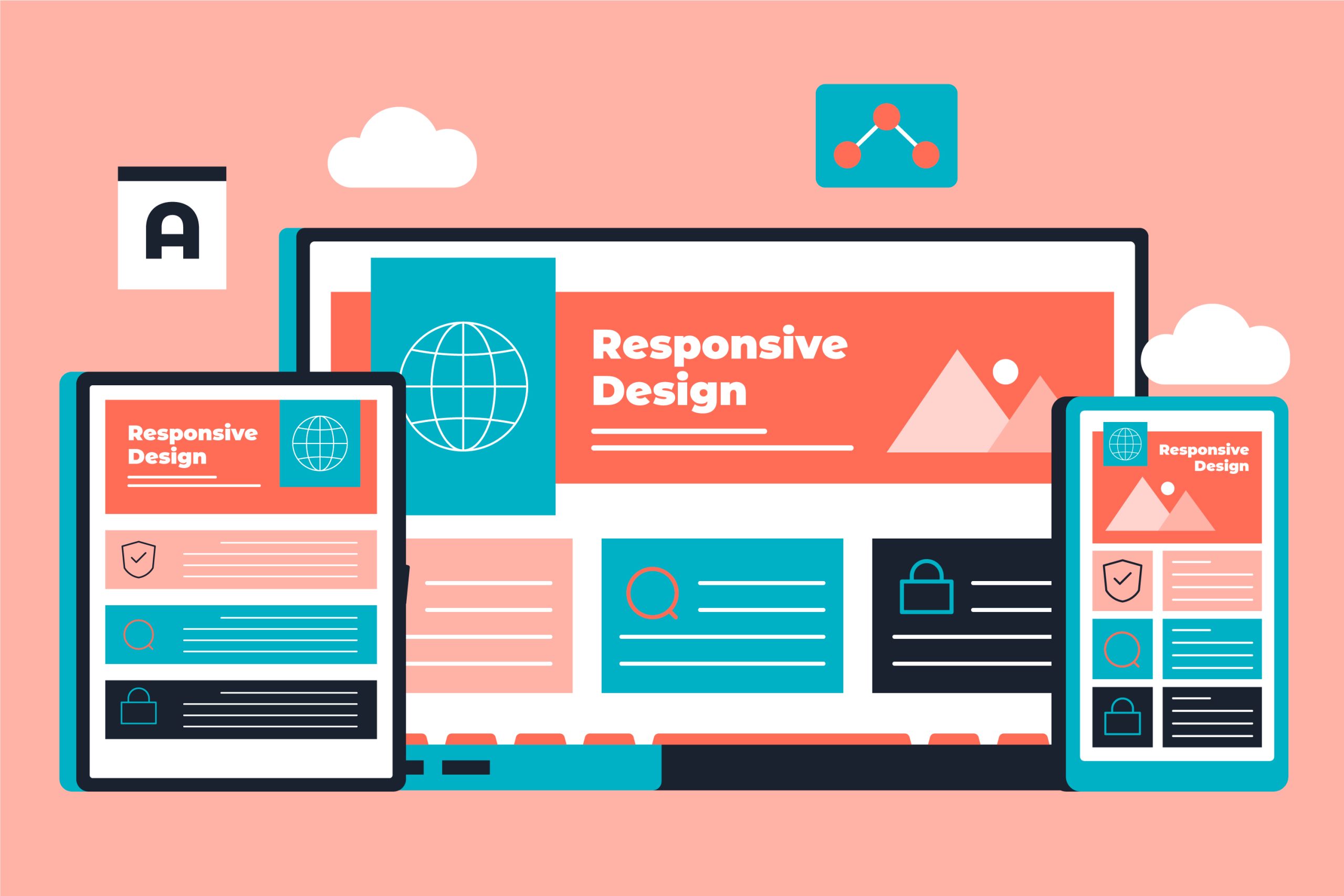
Responsive Website Design: A Quick Intro
Think about the last time you opened a website on your phone and then on your laptop. The layout probably looked a little different, yet it felt just right on both. That is what responsive website design is all about. It is the process of building a site that adjusts itself to fit the screen it is being viewed on.
The idea is simple: make the design flexible so it works anywhere. Instead of using one rigid layout, the elements on the page move, shrink, or grow depending on the device. It is like swapping concrete blocks for fabric that stretches in any direction.
A few things usually make this work:
- Fluid grids that rely on percentages instead of fixed measurements
- Images and videos that resize to fit neatly inside their space
- CSS media queries that switch layouts when the screen reaches certain widths
- Mobile-first design, so smaller screens are always considered first
People are no longer browsing only from desktop computers. Phones, tablets, foldables, and even smart TVs are in the mix. If your site cannot adapt, visitors will not stick around. Responsive design makes sure that no matter how someone visits your site, it will look and feel right for them.
Why You Need Responsive Website Design
Let’s be clear. This is not optional anymore. If your site is not responsive, you are already losing traffic, rankings, and conversions.
Here is why:
- Over 55 percent of global website traffic comes from mobile devices
- Google uses mobile-first indexing, meaning it ranks your site based on its mobile version
- Non-responsive sites have high bounce rates and poor engagement
- Users leave unresponsive pages in seconds and rarely return
The modern web experience must be consistent across devices. A responsive site is faster, cleaner, and easier to use. It improves everything from SEO to sales. Without it, you are basically invisible on mobile, which is where the majority of users now are.
Whether you are running a storefront, a portfolio, or a content site, responsive website design is the only way to stay competitive and relevant.
Use Fluid Grid Layouts Instead Of Fixed Pixels
This is the foundation of responsive design. In the old days, websites were built using fixed-width layouts. Developers would define exact pixel widths for columns, images, and containers. That worked fine when screen sizes were uniform. But today, screens come in every shape and size.
A fluid grid uses percentages instead of fixed pixels to determine widths. For example, instead of making a column 400 pixels wide, you set it to 33.33 percent of its parent container. This way, it adjusts to the screen.
Here is why this matters:
- It allows layouts to scale without breaking
- It avoids horizontal scrolling
- It ensures consistent spacing on all devices
- It makes your site future-friendly
Everything on the page becomes relative to its container. This allows your site to breathe and flow across mobile, tablet, and desktop without needing three different designs. Responsive website design starts here.
Make Images And Videos Responsive
One of the fastest ways to break a website on mobile is to use images and media that do not resize properly. On a desktop, large visuals might look stunning. On a phone, they can overwhelm the screen or get cut off entirely.
The easiest way to keep visuals working on any screen is to let them breathe a little. Make your images and videos adjust themselves to the space they are in. When they stay tucked neatly inside the layout, the design flows the way it should, and nothing feels out of place.
This approach comes with a few perks:
- You avoid the dreaded side–to–side scrolling that breaks the mood
- Smaller screens get smaller files, which means quicker loading
- Pictures and videos keep their crisp look no matter where they appear
If you are adding videos, whether they are product walk–throughs or customer stories, give them room to adapt. On mobile, that might mean filling the space without crowding it, or scaling down without turning into a tiny, unreadable box.
Use Media Queries For Adaptive Layouts
Not all screens are created equal, and your design should reflect that. The layout that works beautifully on a wide desktop screen probably needs to look different on a phone.
That is where screen-based layout changes come in. Designers use what are called media queries to define layout styles depending on the screen size. For example, a three-column layout might stack into a single column on mobile to make things easier to read and scroll through.
This technique allows you to:
- Create clear breakpoints where layout changes improve readability
- Hide or rearrange elements that are not helpful on smaller screens
- Adjust spacing, font sizes, or visual hierarchy based on screen width
This ensures your site feels natural on every device. It is not just about shrinking things. It is about reorganizing the layout to suit the screen.
This flexibility is what makes responsive website design stand out!
Think Mobile Website Design First, Then Scale Up
That smooth shift from one device to another? That is responsive website design in action.
It is not about locking a layout into place and hoping it works everywhere. It is about building a site that can flex. Images, text, menus, all of it moves around to fit whatever screen is in front of it. Think of it like trading in bricks for stretchy fabric. The fabric bends and reshapes without breaking.
A few things make it work:
- Grids that use percentages instead of fixed measurements
- Images and videos that adjust to the space they are in
- CSS media queries that tweak layouts at certain breakpoints
- A mobile-first mindset, so the smallest screens get priority
People are no longer just browsing from laptops. Phones, tablets, foldable screens, even TVs, they are all in play. If your design cannot keep up, you lose visitors fast. Responsive design keeps things smooth, no matter where someone lands on your site.
Optimize Typography For Readability Across Devices
If people have to zoom or scroll sideways to read, they are gone. Font sizes need to scale with the device. Flexible units like ‘em’ or ‘rem’ help here, along with good line spacing and contrast.
Some quick rules that work:
- Keep body text around 16–18px
- Use a line height of at least 1.5
- Check that your color contrast passes accessibility tests
- Adjust sizes with media queries when needed
Break up your text. Use headings, short paragraphs, and breathing space so people can skim. On mobile, scanning happens first, reading second. Make it easy for them.
Create Navigation That Works On All Devices
One of the first things users interact with is your navigation. If it is not responsive, the whole experience collapses. On a desktop, you might have a full horizontal menu. But that same menu will not fit on a phone. It needs to collapse into something manageable, like a hamburger menu.
A few rules for good responsive navigation:
- Use collapsible menus on mobile
- Make links large enough to tap with thumbs
- Avoid hover menus, which do not work on touch devices
- Keep navigation items short and focused
You can also hide secondary options inside accordion menus or submenus. This keeps things clean and decluttered. Navigation is especially important in mobile website design, where space is limited. A confusing menu leads to frustration. A clear one creates flow.
Design for clarity. Make it easy for users to get where they want to go with minimal effort.
Improve Website Speed For All Devices
Performance is part of design. No one waits for a slow site to load. And with responsive website design, your layout should not just look good. It should load fast, too.
Here is how you keep things light:
- Compress images and serve next-gen formats
- Minify CSS, JavaScript, and HTML
- Enable caching
- Use a content delivery network
- Lazy-load images and videos
- Remove unnecessary plugins and scripts
Mobile users often rely on slower connections. A site that loads in 1.5 seconds on fiber might take 5 seconds on 3G. That delay can mean the difference between a visitor and a bounce. Page speed affects rankings, conversions, and credibility. It is not a back-end issue. It is a core part of responsive website design that every developer and designer should focus on.
Test Your Website On Real Devices
Simulators are useful, but nothing replaces actual device testing. The only way to know how your site feels on a real phone or tablet is to use one.
Testing should cover:
- Touch responsiveness
- Layout integrity
- Load time
- Orientation changes
- Font readability
- Menu interactions
Check across different browsers too. Safari on iOS behaves differently from Chrome on Android. What works in Firefox might glitch in Edge. Responsive design is about creating experiences that feel right everywhere. That means real-world testing is essential. Build, test, refine. Repeat as needed.
No emulator or tool can replicate how a user feels when browsing your site on the train or waiting in line at a coffee shop. Test where your users are.
Don’t Just Design It, Make It Responsive!
A site that looks good is fine. A site that works everywhere?
That is what people actually remember. These days, web design is not about making one perfect layout and hoping it holds up. Screens come in every size you can imagine, and tomorrow there will probably be new ones. So the real goal is flexibility. You want a design that can stretch, shrink, and rearrange itself without breaking the experience.
Responsive design is not some neat trick we pull out when the client asks about mobile. It is the baseline. You get there with a mix of things: fluid grids, images that know how to behave, media queries that step in at the right time, and choices that keep speed and performance in check. Then you think mobile first, strip navigation down to what people actually use, and run it through real-world testing instead of just assuming it works.
The internet will keep changing. Devices will fold in half, screens will roll up, and who knows what else. But if your design focuses on the person using it instead of the gadget in their hand, you will not be scrambling every time something new comes out. You will already be ready.