Tribute wall setups don’t always go according to plan. Sizes get miscalculated, materials cause problems, and deadlines have a way of arriving faster than expected. None of that is unusual – it’s just part of the process. What matters in the end is whether the finished wall does its job. And with the right materials and a clear plan, it will.
By morning, somehow, it all came together. And when people walked in and stopped in front of that wall – some of them quietly, some of them with tears – I realized none of my panic mattered. What mattered was that it existed.
That experience is the reason I wrote this. Not as a professional event planner, not as a print shop owner – just as someone who learned the hard way, a few times over, what actually works when you’re trying to build something meaningful without spending a lot of money.
Let’s Talk About What a Tribute Wall Actually Is
You’ve probably seen one and not known what to call it. It’s that dedicated corner at a funeral reception with photos and flowers. The backdrop at a retirement party covered in pictures and a name in large letters. The display at a school gymnasium honoring graduates or veterans. That’s a tribute wall.
Price has very little to do with whether a tribute wall actually works. A $900 setup with the wrong photos and generic text will get glanced at and forgotten. A $35 vinyl banner with the right name, the right image, and one honest line of text will stop people in their tracks. What makes the difference is the thought put into it, not the money spent on it.
So Why Vinyl Specifically?
Honestly, I stumbled into vinyl banner because I couldn’t afford the alternatives. Canvas prints were too expensive. Foam board looked cheap up close. Professional backdrop rentals are a significant expense for what is typically a one-day setup. Vinyl printing covers the same ground at a much lower price point – sharp image output, reliable durability, and enough size flexibility to work for almost any space. For budget tribute wall builds, it consistently makes more practical sense than the alternatives. Here’s what sold me:
The print quality is legitimately good. Photos come out sharp, text is clean, and colors hold well – even in direct sunlight if you’re outdoors. For Memorial Day decor events held outside, this matters more than people realize.
It’s also forgiving on the wallet. A full 4×6 banner with a custom design can cost as little as $18–$35 in the US. That’s not a lot of money for something that becomes the centerpiece of an event.
And it’s reusable. I’ve taken down banners, rolled them up carefully, and stored them for years. The material holds up.
Before You Order Anything, Do This First
Planning before ordering saves a lot of problems down the line. The most common and avoidable mistake is getting the sizing wrong – ordering a banner that’s too small for the space, or too large for the frame being used. Measure the actual wall or backdrop area before anything else. Know whether the setup is going against a physical wall, a backdrop stand, or a freestanding frame – because each one has different size limitations and mounting requirements.
Content direction matters just as much as dimensions. A military tribute wall carries different visual weight than one honoring a teacher or a longtime community member. The imagery, the color choices, the tone of the text – all of it shifts depending on who is being honored and why.
Are you going for dignified and quiet? Warm and celebratory? Proud and patriotic? Nail down the feeling before you nail down the design.
Set a real budget. Not a vague “I want to keep it reasonable” budget – an actual number. You can build something genuinely beautiful for $40 or $80 or $150. But you need to know your ceiling before you start clicking around on print sites.
What You’ll Actually Need (And What Things Cost)
Your main backdrop banner. This is the anchor of the whole wall. Everything else orbits around it. For a space that needs presence – a community hall, a church reception room, an outdoor pavilion – you want at least a 4×6. A 4×8 is better if the space allows it.
Banner printing has specific file requirements that are easy to overlook until the finished product arrives. Resolution is the main one. The standard is 300 DPI – below that, photos tend to lose sharpness and detail when printed at large sizes.
Social media photos and screenshots are frequent culprits here because they look acceptable on screen but fall apart in print. If the source images available are low resolution, the right move is to contact the printer before finalizing the order.
Viewing distance affects how much resolution matters – a large outdoor banner viewed from several feet away has more flexibility than a close-up display – but the printer needs to know the specifics to advise correctly.
Smaller vinyl signs. These are your supporting details – a meaningful quote, a branch of service, a birth and passing year, a nickname. If you own a Cricut or Silhouette cutter, you can produce these at home for almost nothing using adhesive vinyl on painted wood or foam board. If not, small vinyl prints are very cheap to order alongside your main banner.
Something to hang it on. Mounting method depends on the setup. Wall-mounted banners are simplest – heavy-duty Command strips hold vinyl securely against most surfaces and remove without damaging paint underneath. Freestanding frames take slightly more assembly but not much.
A PVC pipe frame using two vertical poles, one horizontal crosspiece, and basic fittings from any hardware store costs under $12 and handles standard banner weight without issue. Stability at the base is important, particularly for outdoor setups. Sandbags are the most reliable ballast. Water jugs and heavy planters are workable alternatives for indoor use.
Lights. I cannot overstate how much a $7 string of warm fairy lights changes the feel of a tribute wall. It goes from “event display” to something that actually draws people in. Drape them along the frame edges or behind a sheer fabric layer if you want a softer glow.
A length of plain neutral fabric behind the vinyl elements is one of the cheapest upgrades a tribute wall can get. Cream, grey, navy, or black – nothing patterned, nothing bright – draped behind the display adds depth and texture that a flat surface does not provide. It does not compete with the banner graphics or photos in front of it. It just makes everything in front of it look better.
How to Design a Tribute Banner Without Overcrowding It
Tribute banners that carry too much content are consistently harder to read than ones that carry less.One extra photo is fine. One extra quote is fine. But stack enough of those decisions on top of each other and the whole layout starts working against itself. The focal point gets buried, the text becomes hard to scan, and the banner ends up looking busy rather than meaningful. No single addition causes that – it is the accumulation of all of them together.
What works instead is a simple, deliberate structure. One central photo. Name in large clear lettering. Dates below the name. One supporting line of text – something specific and meaningful. Kept to those elements, with clean spacing throughout, a tribute banner reads clearly and registers the way it is meant to.
That’s it. Five elements. People try to squeeze in seven photos and three quotes and a decorative border and a logo and suddenly it looks like a flyer for a local event rather than a tribute to someone’s life.
For color, two or three tones maximum. Color combinations that work for tribute walls tend to be restrained ones. Navy and gold reads as formal and considered. Black and white with a single warm accent – gold, rust, or deep red – feels modern without drawing attention away from the content.
Memorial Day decor calls for the obvious palette, but obvious does not have to mean heavy-handed. A deep navy base with white text and one clean red horizontal rule does the job without tipping into decoration territory. That reads as proud and intentional, not costume-party patriotic.
When you submit your files, always ask for a digital proof before anything goes to print. Every reputable shop offers this. If yours doesn’t, ask anyway. Errors on printed banners show up after delivery, not before. By then, reprinting is rarely an option. Reviewing the proof carefully – every name, every date, every line of text – before confirming the order is the only way to catch mistakes while there is still time to correct them.
How to Put a Tribute Wall Together From Start to Finish
Main banner placement comes before anything else in the setup process. Get it centered on the wall or frame horizontally, then sort out the height. Viewing height matters here – the banner should sit at standing eye level, not mounted high on the wall the way artwork sometimes is. Slightly lower than the first instinct is usually the right call.
Step back. Look at it from the distance your guests will actually see it from, not from two feet away. This is important. A lot of alignment issues that look glaring up close disappear entirely from across the room, and vice versa.
Once the main banner is placed, build outward from it. Add your smaller vinyl signs, your framed photos if you’re including any, your fabric layers. Work in odd numbers of elements – three, five, seven. Even groupings feel rigid and planned. Odd groupings feel natural, like things were gathered rather than arranged.
Add lights last, after everything else is placed. Plug them in, look at the whole wall in the actual lighting of the venue, and adjust from there.
Budget two to three hours minimum for setup. Even if you’ve done this before. Even if it’s a simple layout. Something always takes longer than expected – a Command strip that won’t stick, a banner corner that keeps curling, a string of lights with a dead bulb in the middle. Give yourself time
A Few Thoughts on Memorial Day Tribute Walls Specifically
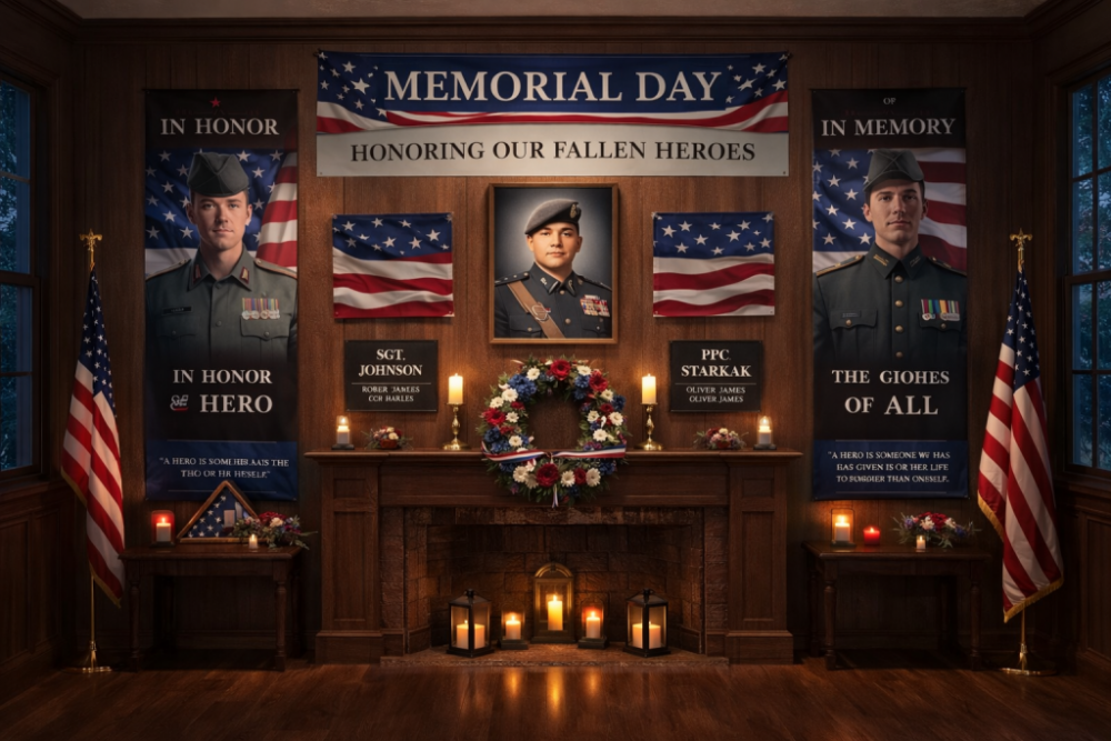
Memorial Day carries a weight that most other occasions don’t. Generic tribute displays are easy to walk past. A banner that reads “In Honor of Our Veterans” covers the obligation but does very little beyond that. Specific content – a name, a face, a timeframe, a branch of service – is what actually stops people and gives them something to engage with.
For events covering multiple honorees, the individual approach works better than trying to combine everyone into one layout. A 12×18 vinyl portrait sign per person, arranged in a grid, gives each individual proper recognition rather than folding them into a collective display where individual details get lost.
The effect of seeing twenty or thirty individual faces on a wall, each one someone’s family member, is something a single group banner can never replicate.
For branch-specific details, incorporate the right imagery. A Navy veteran’s tribute should feel different from an Army veteran’s. Colors, insignia, language – these details matter to the people who served and to their families.
The Mistakes Worth Warning You About
Ordering too small. If you’re torn between two sizes, get the bigger one. Banners almost always look smaller in a real space than they do in the online preview.
Not checking your photo resolution. Seriously. Check it before you submit. Ask your printer if you’re not sure.
Adding too many elements. Every single thing on that wall should earn its place. If you’re debating whether something belongs, it probably doesn’t.
Skipping the proof. One more time, for the people in the back: always approve a digital proof before printing.
Underestimating setup time. I’ve never once finished setting up a tribute wall faster than I thought I would. Budget generously.
One Last Thing
The people who stood in front of the tribute wall I built for my uncle didn’t know it was made from a $22 banner and $8 worth of fairy lights. They just stood there, quietly, and looked at his face.
That’s the whole point. Not the materials. Not the budget. Just the fact that someone cared enough to make a space where people could stop, remember, and feel something.
You can do that. It doesn’t require a big budget or professional tools. It requires paying attention to the person you’re honoring and making choices that reflect that.
Start with your main custom banner. Build the frame. Add the lights. Step back and look at it.
You’ll know when it’s right.