Designing a modern space means more than just choosing beautiful materials. It means understanding how elements work together. When walls and wood finishes clash, the entire room feels off. But when they align, the result is seamless. That’s where laminate sheets come in.
Why colour pairing matters
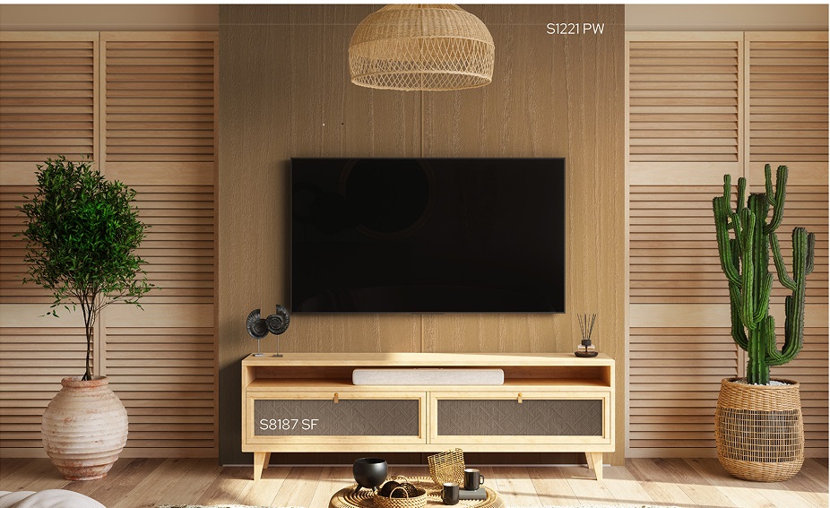
Wall colour can change the entire feel of a room. It affects mood, space perception, and lighting. Laminate sheets can either enhance that feel or fight against it. Matching the two the right way is key.
A cool-toned grey wall with a warm teak finish might look disconnected. But the same wall next to an ash woodgrain laminate can look intentional and balanced. It’s not just about colour. It’s about tone, texture, and depth.
Start with your dominant shade
Pick the main shade in your space. This could be your wall colour or your flooring. Once that’s locked in, laminate sheets can be chosen to either contrast or complement.
- Light beige walls? Go for walnut woodgrains.
- Deep blue walls? Choose a grey oak laminate for balance.
- All-white walls? You’ve got freedom. Almost every woodgrain will work.
The idea is to avoid visual conflict. You want each surface to support the others, not compete.
Think about lighting too
Natural light can change how both paints and laminates look. That soft grey wall might look blue in sunlight. That warm cherry laminate might glow orange under LEDs.
It’s smart to test laminate samples in your actual space. Place them against the wall, look at them in different lights, and see how they behave during the day. What works in a showroom might not work at home.
Match tones, not just colours
Two colours might seem different but still match. That’s because they share the same tone.
- Cool tones: greys, blues, whites with a bluish tint
- Warm tones: creams, browns, reds, yellows
Laminate sheets in warm tones sit better with warm wall colours. Cool-toned walls pair better with cool-toned woodgrains. Mixing tones creates visual tension, which rarely works in a calm, elegant space.
Add contrast, but keep it balanced
Contrast creates interest. But contrast doesn’t mean chaos. It means light and dark, smooth and textured, matte and glossy.
A charcoal wall with a light pine laminate? That’s bold but grounded. A soft cream wall with a dark walnut? That’s warm and refined. Use contrast to highlight, not overwhelm.
Consider the role of texture
Woodgrain laminate sheets add texture. Some are rough, some are smooth. Some reflect light, some absorb it. A textured laminate adds depth to plain walls. A smoother laminate balances bold patterns.
When walls are patterned or textured, go for subtle laminates. If walls are plain, you can be more experimental with the laminate finish. That’s how you build visual rhythm.
Small spaces need smart choices
Dark laminates and bold walls can make small rooms feel tighter. Use lighter laminate sheets to open things up. Pair soft-toned walls with subtle woodgrains. Let natural light bounce around. It gives the illusion of space.
In narrow hallways or compact kitchens, a light oak laminate can lift the mood. Pair it with off-white or soft grey walls for an airy feel.
Experiment with styles
Different woodgrains suggest different design moods.
- Ash and maple: Scandinavian, minimal, clean
- Teak and cherry: Traditional, rich, formal
- Oak and walnut: Versatile, modern, grounded
- Wenge and ebony: Bold, luxury-driven, contemporary
Your wall colour should echo the emotion of the wood. Neutral tones keep things elegant. Stronger colours add drama. It depends on the feeling you want in the space.
Projects found by the client
Sainik Laminates have been used across several homes and offices where coordinated spaces matter. In one interior project, light beige walls were paired with ash woodgrains to give a Nordic-inspired look. Another client matched deep green walls with walnut laminates for a modern library setup. In modular kitchen designs, warm white walls and cherry laminate sheets have created a cosy yet functional cooking zone.
These combinations show how versatile and mood-driven laminate and wall pairings can be. The finish changes how people experience the space. It’s not just visual-it’s emotional.
Don’t forget consistency
One big mistake in design is having every room feel like a different story. Keep a consistent tone across rooms. If one room uses warm woodgrains, carry that warmth into the next.
The walls and laminates may vary, but the tone should stay steady. That creates a flow. And when a home flows, it feels thoughtful. Professional. Complete.
Make small samples your friend
Before finalising, get physical samples. Don’t rely on digital swatches. Test them together-wall colour and laminate sheet-on site. Lighting, angles, and surroundings all influence the outcome.
Live with those samples for a few days. See them in morning light, afternoon glare, and soft evening tones. This real-world check prevents expensive regrets later.
In conclusion
Pairing wall colours and woodgrains is part art, part science. It’s about harmony, contrast, and emotion. And when done well, it elevates the space. Sainik Laminates offers a wide range of laminate sheets that can match almost any interior style or colour palette. With thoughtful planning and creative choices, you can achieve spaces that feel cohesive and beautifully designed.